Joining the association
From curious visitor to a submitted application in one sitting.
8 stepsVisitorMemberCompleting a correction request
One notification takes her straight to the missing document and back to resubmit.
4 stepsMemberRenewing membership
Reminder, readiness check, payment and an updated card, with no surprises.
6 stepsMemberContinuing professional development
Plan missing hours, log an external activity and watch it approved.
4 stepsMemberStaffEarning a professional credential
From choosing a pathway to a publicly verifiable certificate.
6 stepsMemberThird partyAttending an event
Register, QR ticket, check-in, evaluation and CPD credited automatically.
7 stepsVisitorMemberStaffPayment failure and recovery
A failure never loses the request: clear message and a retry by another method.
4 stepsMemberGetting support
Search first, open a ticket with suggestions, follow the thread, then rate.
5 stepsVisitorMemberStaffReviewing a membership application
From the control room to a documented decision.
7 stepsStaffReviewing CPD activities
A decision queue with proofs in front of you and one-tap decisions.
3 stepsStaffClosing the finance day
Payments, reconciliation, maker–checker refunds, then close.
4 stepsStaffEvent check-in (kiosk mode)
Fast, unmistakable scanning even offline.
3 stepsStaffConfiguring the platform
Categories, forms, workflows and roles, with no developer.
4 stepsAdminVerifying a card or certificate
An outside party confirms in seconds with no account.
3 stepsThird partyVisitorUpgrading membership category
Compare, see the difference, pay and get the new card at once.
5 stepsMemberOrganization account and seats
An HR manager manages the company's seats and pays one invoice.
5 stepsMemberUsing benefits and referring a colleague
Use your benefits, invite a colleague and track your reward.
4 stepsMemberVisitorPaying through a link
Staff create a link and the customer pays without an account.
5 stepsStaffVisitorA renewal reminder campaign
Pick the audience, prepare the message, send and measure the result.
5 stepsStaffRequesting my data or deletion
The member asks for his data and staff fulfil it within a documented deadline.
6 stepsMemberStaffOnboarding a new employee
From creating the user to a secure first sign-in and assigned work.
5 stepsAdminStaffA day on the mobile app
Card, event and hours from the phone, even without internet.
5 stepsMemberStaff
01 · #join
Joining the association
From curious visitor to a submitted application in one sitting.
- Who
- Noura, a mining engineer with 8 years of experience, new to the membership tiers.
- Goal
- Find the right category and apply without a phone call.
- Entry point
- A link from an association post or a web search.
- Success metric
- Application submitted in under 15 minutes with complete documents.
Effort vs reassurance
Pain points removed
- Confusion choosing a category
- Re-typing data after an interruption
- Not knowing what happens after submit
- 1Open this step
Landing on the site
/
Screen: Home
- What the user does
- Opens the home page and reads what the association offers.
- What the system shows
- A mining-photography hero with gold dust and a clear “Find your membership” action.
Components used
- Public headerVisitor navigation
Why here: Transparent so the message leads, solid once scrolled.
States: Transparent over hero · solid on scroll
- ButtonPrimary and secondary actions
Why here: One primary button leads to the finder.
States: Default · hover · loading · disabled
UI states covered
- LoadingSkeleton for event cards.
Features:
PUB-01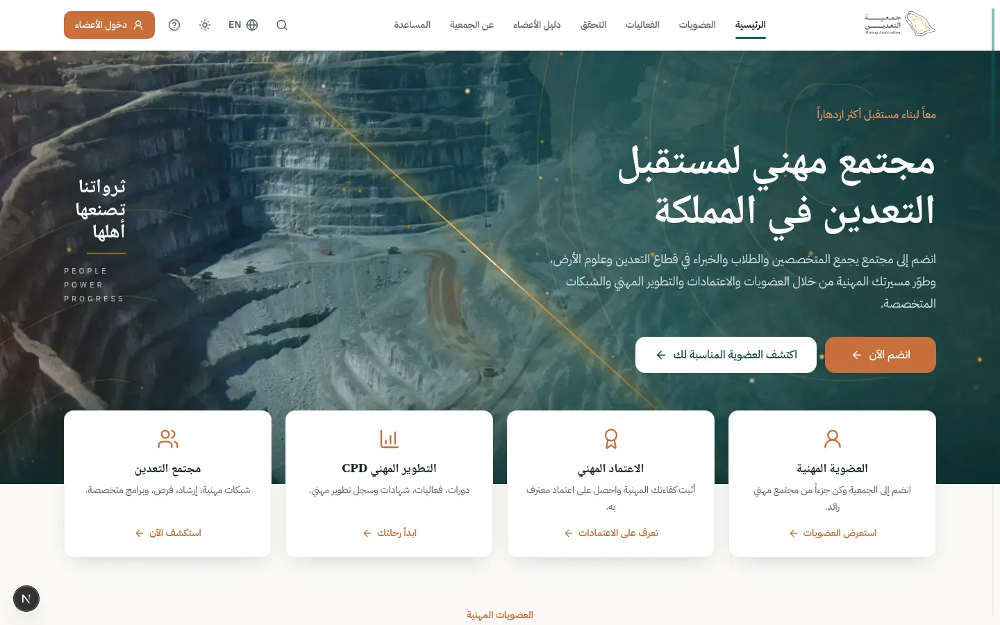
- 2Open this step
Membership finder
/memberships/finder
Screen: Membership finder
- What the user does
- Answers 3 short questions on qualification and experience.
- What the system shows
- An instant recommendation with the reason and anything missing.
Components used
- Choices (Radio / Chip / Segmented)Pick from a few options
Why here: Few options visible at once instead of a dropdown.
States: Selected · unselected · disabled · focus
- CategoryCardMembership category card
Why here: Shows the recommended category with photo and criteria.
States: Default · recommended · selected to compare
UI states covered
- EmptyBefore answering: a note on what will happen.
Features:
PUB-04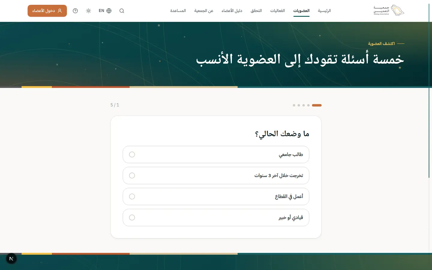
- 3Open this step
Category detail
/memberships/MP
Screen: Membership category
- What the user does
- Reads criteria, fees, benefits and required documents.
- What the system shows
- Concise criteria, fees with VAT and FAQs.
Components used
- CategoryCardMembership category card
Why here: Same summary as in the finder for consistency.
States: Default · recommended · selected to compare
- AccordionCollapsible Q&A
Why here: FAQs collapse so the page stays short.
States: Collapsed · expanded
- ButtonPrimary and secondary actions
Why here: “Start application” leads to sign-up.
States: Default · hover · loading · disabled
Features:
PUB-05PUB-03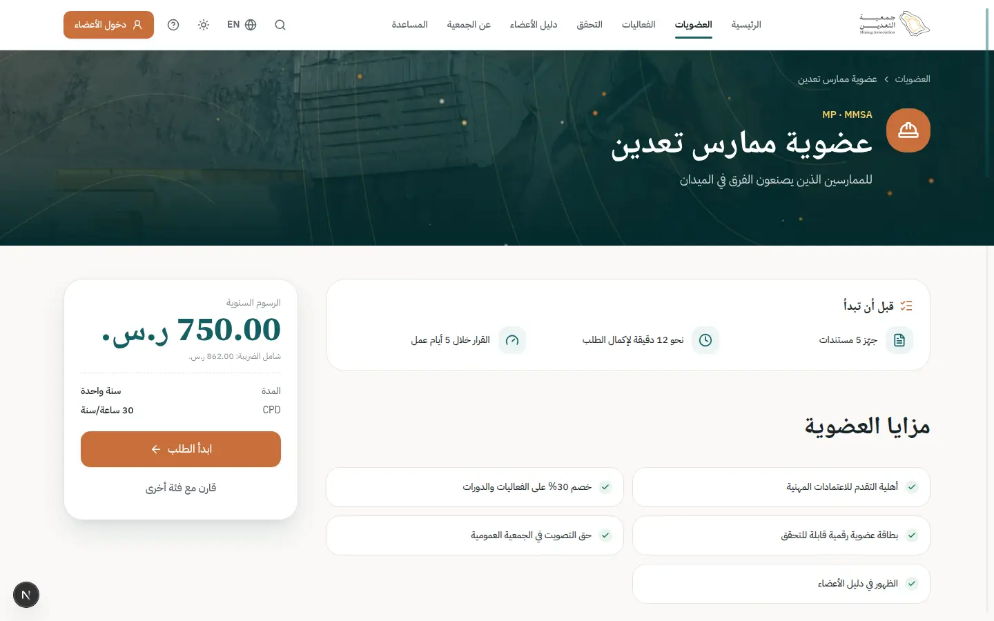
- 4Open this step
Account and OTP
/register
Screen: Create account
- What the user does
- Enters her details and completes the OTP sent to her mobile.
- What the system shows
- A short form, then a 6-digit code with a resend countdown.
Components used
- Field / InputLabelled text fields with help
Why here: Labelled fields with help that prevent errors early.
States: Default · focus · error · disabled · read-only
- OtpInputSegmented verification code
Why here: Paste and SMS autofill.
States: Entry · error (shake) · resend countdown · success
- ErrorSummary + AutosaveIndicatorError summary and autosave
Why here: Linked error summary after a submit attempt.
States: Saving · saved · offline · linked errors
UI states covered
- ErrorWrong code: gentle shake and message.
- SuccessAccount activated, then into the portal.
Features:
IAM-01IAM-03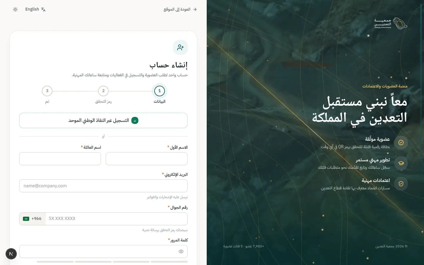
- 5Open this step
Sign in with Nafath (optional)
/nafath
Screen: Sign in with Nafath
- What the user does
- Chooses Nafath verification instead of typing her details.
- What the system shows
- A verification number to match in the Nafath app, then a return with verified data.
Components used
- OtpInputSegmented verification code
Why here: The match code uses the same verification pattern.
States: Entry · error (shake) · resend countdown · success
- AlertInline page alert
Why here: Explains which data is shared.
States: Info · success · warning · error
- Skeleton / EmptyState / ErrorStateLoading, empty and error
Why here: Waiting for app confirmation.
States: Loading · empty · error with retry
UI states covered
- ErrorNafath timed out: retry or register manually.
Features:
IAM-02PLT-05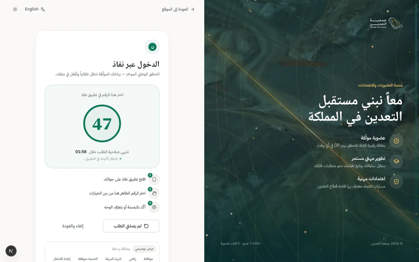
- 6Open this step
Filling the application
/portal/apply
Screen: New membership application
- What the user does
- Moves through form steps and uploads or attaches verified documents.
- What the system shows
- Clear steps, autosave and attached documents with status.
Components used
- Stepper / VerticalStepperWhere the user is in the flow
Why here: Shows where she is and what remains.
States: Done · current · upcoming · has problem
- Select / Combobox / DatePickerReference values and Gregorian/Hijri dates
Why here: Employers and specialties via autocomplete, not free text.
States: Empty · searching · results · no results
- FileUploadUpload or attach a verified document
Why here: Drag-drop, camera or one-tap attach of a verified file.
States: Empty · dragging · uploading · done · rejected
- ErrorSummary + AutosaveIndicatorError summary and autosave
Why here: Autosave reassures that nothing is lost.
States: Saving · saved · offline · linked errors
UI states covered
- OfflineOffline: saved locally and synced later.
- ErrorFile too large or unsupported.
Features:
APP-01APP-02APP-03APP-04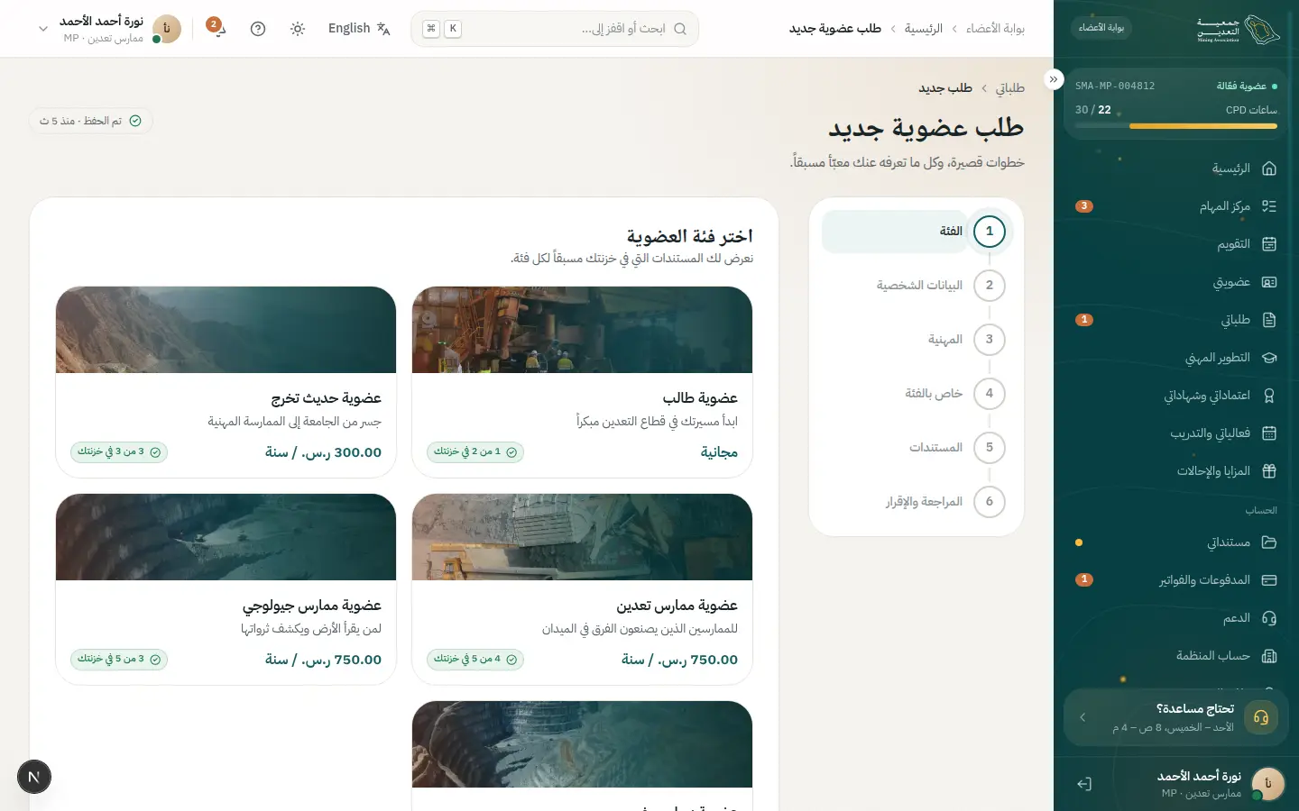
- 7Open this step
Review and submit
/portal/apply
Screen: New membership application
- What the user does
- Reviews the summary, confirms accuracy and submits.
- What the system shows
- A success moment with the reference number and next steps.
Components used
- SuccessMomentA big success moment
Why here: A big moment deserves a distinct confirmation.
States: Success (gold dust) · calm under reduced motion
- notify (Toast)Quick confirmation with undo
Why here: Confirms the email notification.
States: Success · error · with undo
UI states covered
- SuccessReference number + downloadable copy.
Features:
APP-06 - 8Open this step
Tracking the request
/portal/requests
Screen: My requests
- What the user does
- Opens “My requests” to see the status.
- What the system shows
- Status, owner and expected decision date.
Components used
- StatusBadgeStatus with colour, icon and text
Why here: One understandable status with colour, icon and text.
States: Every dictionary status
- NextStepPanelWho owns it? What do I do? When?
Why here: Answers who owns it now and what she must do.
States: Waiting on me · waiting on SMA · done
UI states covered
- EmptyBefore the first request: invitation to apply.
Features:
APP-07HOM-07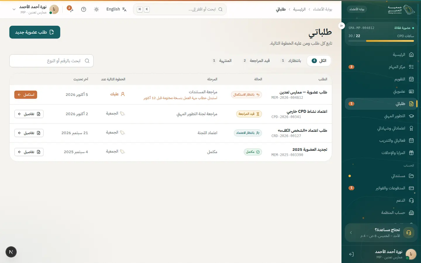
02 · #correction
Completing a correction request
One notification takes her straight to the missing document and back to resubmit.
- Who
- Noura after the reviewer asked for the stamped experience letter (MEM-2026-004812).
- Goal
- Upload the missing item quickly without restarting.
- Entry point
- A notification (mobile, email or in-portal).
- Success metric
- Resubmitted within 24 hours of the notice.
Effort vs reassurance
Pain points removed
- Unclear what exactly is needed
- Hunting for the request
- Fear of losing what was already sent
- 1Open this step
The notification
/portal/notifications
Screen: Notifications
- What the user does
- Opens the “correction needed” notification.
- What the system shows
- Text naming the missing document and a “Complete now” action.
Components used
- StatusBadgeStatus with colour, icon and text
Why here: An “awaiting correction” badge sums up the state.
States: Every dictionary status
- ButtonPrimary and secondary actions
Why here: A direct button to the request, not a list.
States: Default · hover · loading · disabled
UI states covered
- EmptyNo notifications: a calm message.
Features:
NTF-06NTF-02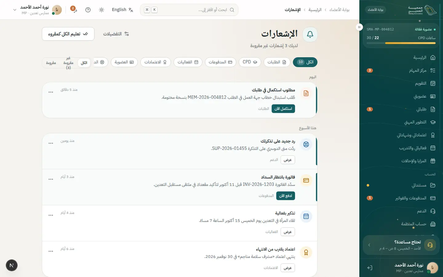
- 2Open this step
Task center
/portal
Screen: Home
- What the user does
- Sees it as the first urgent task on home.
- What the system shows
- A task card with a due date and a button into the right screen.
Components used
- TaskCardA task that opens its screen
Why here: Everything waiting on her, prioritised.
States: Urgent · normal · done · empty
- Portal shellSide/top bars and ⌘K search
Why here: The bell shows the unread count.
States: Expanded · collapsed · new notifications
UI states covered
- LoadingSkeleton while tasks load.
Features:
HOM-02HOM-01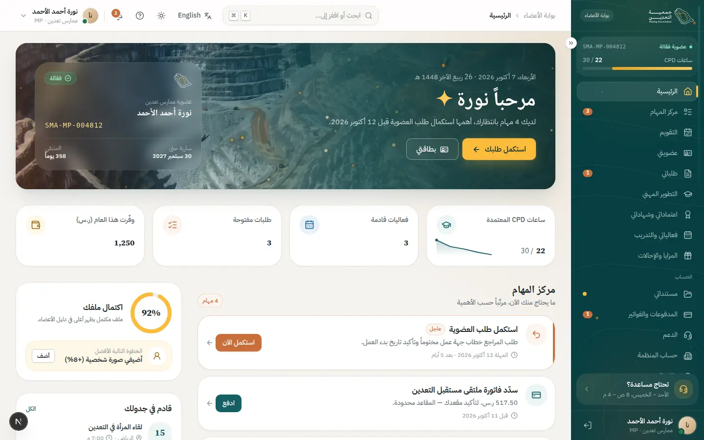
- 3Open this step
Correction mode
/portal/requests/MEM-2026-004812
Screen: Request detail + corrections
- What the user does
- Reads the reviewer's reason and uploads the document.
- What the system shows
- The next-step panel, a highlighted missing document and the request timeline.
Components used
- NextStepPanelWho owns it? What do I do? When?
Why here: Says “it is on you”, what and by when.
States: Waiting on me · waiting on SMA · done
- DocumentCardA document and its status
Why here: The rejected document shows its reason beside it.
States: Verified · in review · rejected · expired
- FileUploadUpload or attach a verified document
Why here: Upload in place.
States: Empty · dragging · uploading · done · rejected
- TimelineRequest events with dates
Why here: A record of what has happened so far.
States: Past · current pulses · upcoming
UI states covered
- ErrorUpload failed: one-tap retry.
- OfflineAttachment queued until back online.
Features:
APP-07APP-08APP-04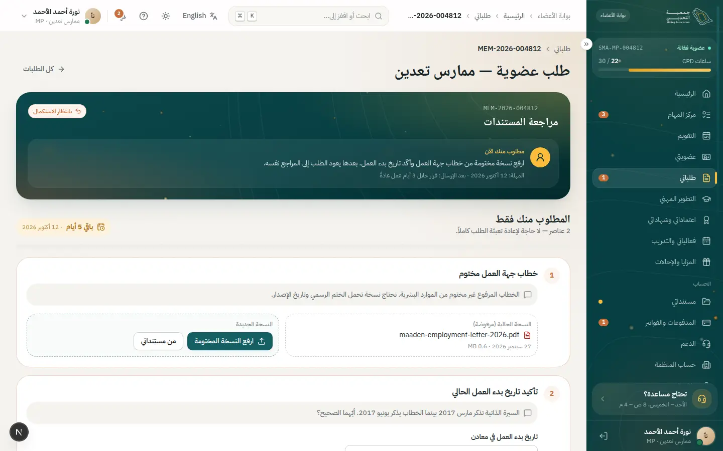
- 4Open this step
Resubmit
/portal/requests/MEM-2026-004812
Screen: Request detail + corrections
- What the user does
- Presses “Resubmit” after attaching the missing item.
- What the system shows
- Status becomes “under review” and a new timeline event appears.
Components used
- notify (Toast)Quick confirmation with undo
Why here: Quick confirmation with undo.
States: Success · error · with undo
- StatusBadgeStatus with colour, icon and text
Why here: New status shown immediately (optimistic).
States: Every dictionary status
- TimelineRequest events with dates
Why here: The new event pulses as current.
States: Past · current pulses · upcoming
UI states covered
- SuccessResubmitted and the reviewer notified.
Features:
APP-08APP-07
03 · #renew
Renewing membership
Reminder, readiness check, payment and an updated card, with no surprises.
- Who
- Khalid, a 3-year member whose membership expires in 30 days.
- Goal
- Renew before expiry without losing benefits.
- Entry point
- A reminder 30 days before expiry.
- Success metric
- Over 85% renew before the expiry date.
Effort vs reassurance
Pain points removed
- Discovering a blocker (CPD/document) at payment
- Unclear final amount
- Waiting for the card to update
- 1Open this step
The reminder
/portal/notifications
Screen: Notifications
- What the user does
- Opens the renewal reminder.
- What the system shows
- Message with the expiry date and a “Renew now” button.
Components used
Features:
NTF-03LIF-05 - 2Open this step
My membership
/portal/membership
Screen: My membership
- What the user does
- Reviews status and expiry date.
- What the system shows
- Digital card with an “expiring soon” badge and a renew button.
Components used
- MembershipCardDigital card with QR
Why here: Shows the card, QR and its state.
States: Active · expiring · expired · offline QR
- StatusBadgeStatus with colour, icon and text
Why here: “Expiring soon” in text, not colour alone.
States: Every dictionary status
UI states covered
- OfflineCard and QR work offline.
Features:
LIF-02LIF-03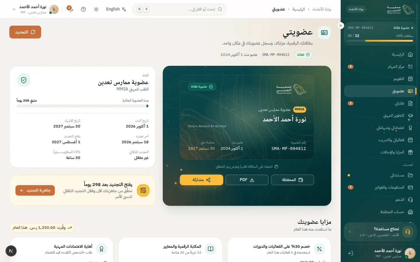
- 3Open this step
Renewal readiness
/portal/membership/renew
Screen: Renew membership
- What the user does
- Resolves blockers: CPD hours, an expired document.
- What the system shows
- A blocker list with direct buttons; completing it enables “Continue”.
Components used
- ReadinessChecklistBlockers, each with a direct action
Why here: Surfaces blockers before payment, not after.
States: Blocked · ready · all done enables CTA
- CpdProgressApproved vs required hours
Why here: Shows remaining hours.
States: On track · pending · gap · complete
- DocumentCardA document and its status
Why here: An expired document with a renew button.
States: Verified · in review · rejected · expired
UI states covered
- SuccessAll ready: the button enables with a calm motion.
Features:
LIF-05CRD-08CPD-06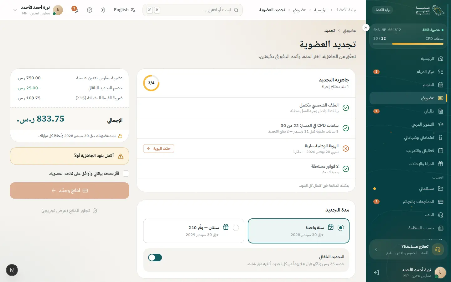
- 4Open this step
Choosing the plan
/portal/membership/renew
Screen: Renew membership
- What the user does
- Picks one or two years and reviews fees.
- What the system shows
- Fee, VAT, total and new expiry date.
Components used
- Choices (Radio / Chip / Segmented)Pick from a few options
Why here: Switch term in one tap.
States: Selected · unselected · disabled · focus
- MoneySummary / AuditSummaryAmount, VAT and total
Why here: The full amount before leaving for the gateway.
States: Before payment · paid · refunded
Features:
LIF-06PAY-02 - 5Open this step
Checkout
/portal/payments/checkout
Screen: Checkout
- What the user does
- Chooses a payment method and confirms.
- What the system shows
- Order summary, a secure hand-off and a return with the result.
Components used
- MoneySummary / AuditSummaryAmount, VAT and total
Why here: The same summary throughout.
States: Before payment · paid · refunded
- ButtonPrimary and secondary actions
Why here: A pay button with loading that blocks double-clicks.
States: Default · hover · loading · disabled
- Skeleton / EmptyState / ErrorStateLoading, empty and error
Why here: Skeleton while waiting for the gateway.
States: Loading · empty · error with retry
UI states covered
- LoadingRedirecting to the gateway.
- ErrorPayment failed: see the payment-failure journey.
Features:
PAY-02PAY-03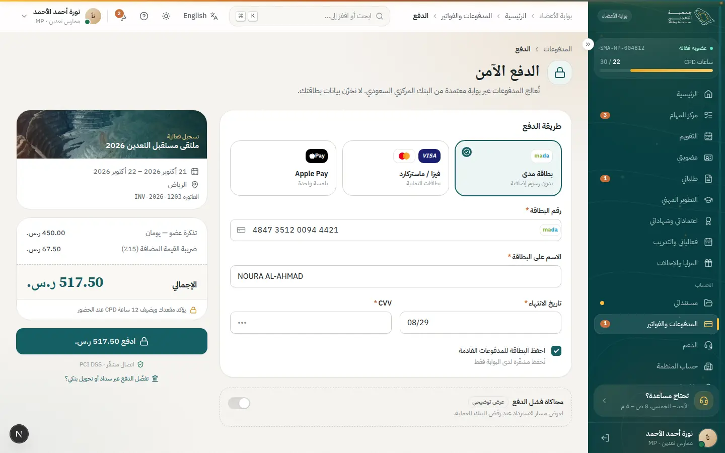
- 6Open this step
The updated card
/portal/membership
Screen: My membership
- What the user does
- Returns to “My membership”.
- What the system shows
- A card with the new date, a receipt and confirmation.
Components used
- MembershipCardDigital card with QR
Why here: Updates instantly with a fresh QR.
States: Active · expiring · expired · offline QR
- SuccessMomentA big success moment
Why here: An activation confirmation moment.
States: Success (gold dust) · calm under reduced motion
UI states covered
- SuccessPDF receipt and email notice.
Features:
LIF-01PAY-05
04 · #cpd
Continuing professional development
Plan missing hours, log an external activity and watch it approved.
- Who
- Khalid needs 20 CPD hours a year and has 12.
- Goal
- Close the gap before renewal.
- Entry point
- The CPD card on home or a renewal blocker.
- Success metric
- Hours complete 60 days before renewal.
Effort vs reassurance
Pain points removed
- Tracking hours in personal spreadsheets
- Not knowing accepted activity types
- Unclear rejection reasons
- 1Open this step
Gap planner
/portal/cpd
Screen: CPD
- What the user does
- Sees done vs remaining plus suggested activities.
- What the system shows
- A progress ring, split by type with caps, and events that cover the gap.
Components used
- CpdProgressApproved vs required hours
Why here: Approved and pending shown separately.
States: On track · pending · gap · complete
- ChartsCharts and trend indicators
Why here: Distribution by type.
States: Data · loading · empty
- EventCardAn event or course
Why here: Suggested events that fill the gap.
States: Open · full · waitlist · registered
UI states covered
- EmptyNo activities yet: invitation to add one.
Features:
CPD-03CPD-06CPD-07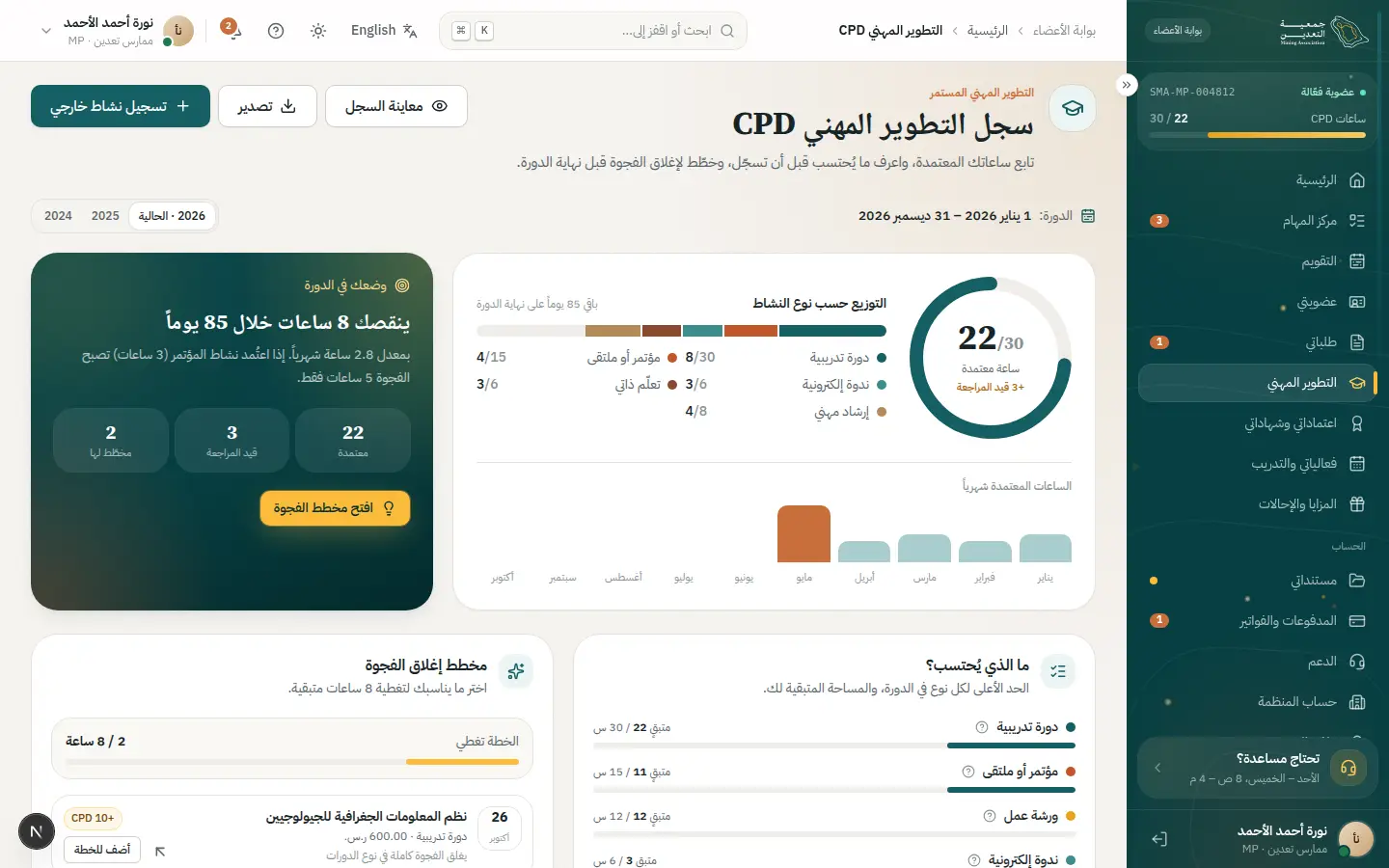
- 2Open this step
External activity sheet
/portal/cpd
Screen: CPD
- What the user does
- Adds an external activity with its certificate.
- What the system shows
- A side sheet: type, date, hours and proof.
Components used
- Sheet / ConfirmDialogSecondary task without leaving the page
Why here: A sheet keeps page context visible.
States: Closed · open · confirm for irreversible
- Select / Combobox / DatePickerReference values and Gregorian/Hijri dates
Why here: Activity type from a reference list.
States: Empty · searching · results · no results
- FileUploadUpload or attach a verified document
Why here: Proof upload.
States: Empty · dragging · uploading · done · rejected
- Field / InputLabelled text fields with help
Why here: Hours with instant cap validation.
States: Default · focus · error · disabled · read-only
UI states covered
- ErrorActivity-type cap exceeded.
Features:
CPD-02CPD-03 - 3Open this step
Staff review
/admin/cpd
Screen: CPD review
- What the user does
- Staff checks the proof and approves or rejects.
- What the system shows
- The activity row in the queue and a proof sheet.
Components used
- DataTableTable with views, filters and record sheet
Why here: A queue with saved views and filters.
States: Loading · empty · multi-select · board
- StatusBadgeStatus with colour, icon and text
Why here: Under review to approved/rejected.
States: Every dictionary status
UI states covered
- EmptyQueue empty: “nothing waiting”.
Features:
CPD-04CPD-09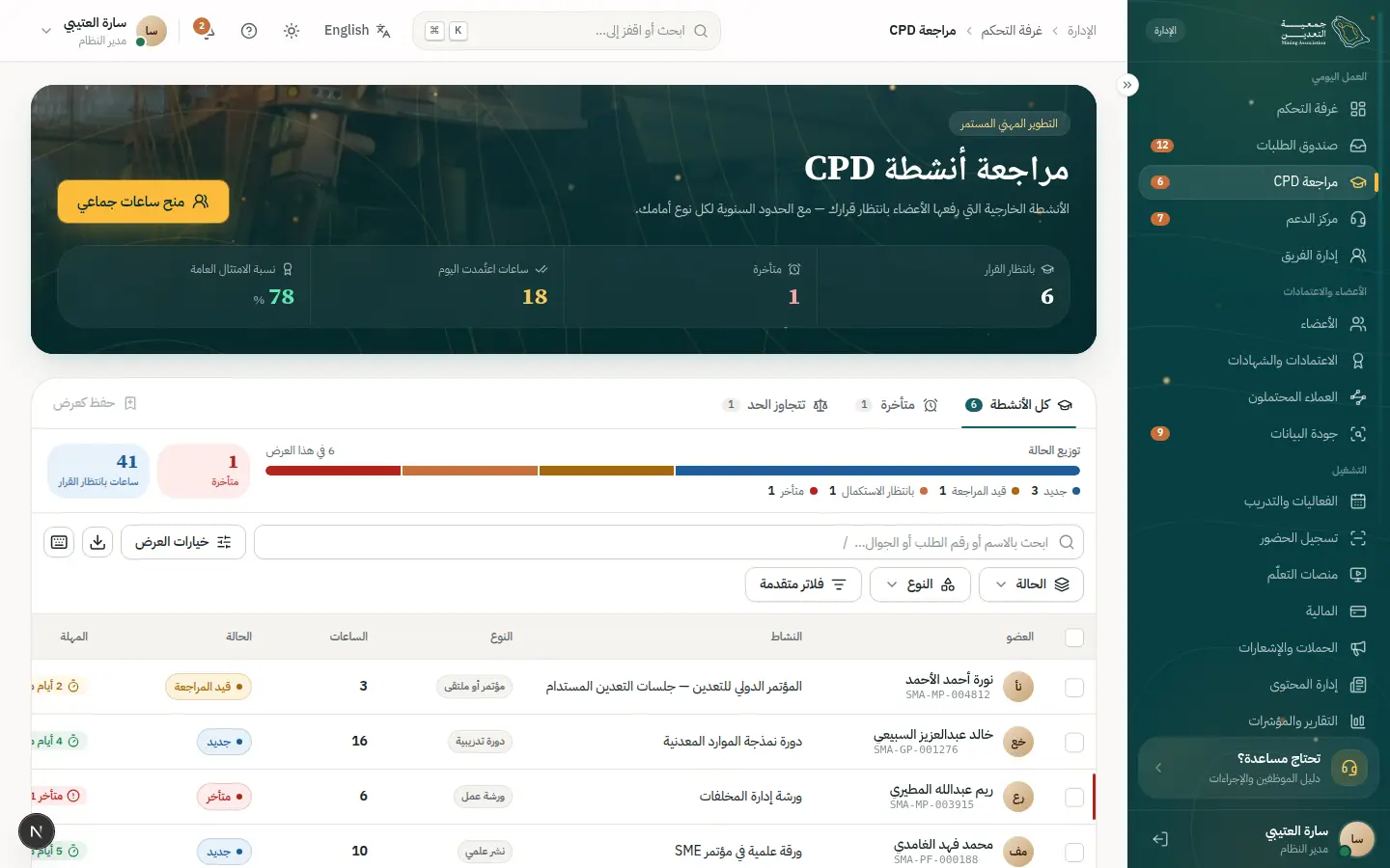
- 4Open this step
Ledger and approval
/portal/cpd
Screen: CPD
- What the user does
- Sees the outcome in the hours ledger.
- What the system shows
- Hours move from pending to approved with a notice.
Components used
- CpdProgressApproved vs required hours
Why here: Progress animates.
States: On track · pending · gap · complete
- TimelineRequest events with dates
Why here: Activity ledger with dates.
States: Past · current pulses · upcoming
- notify (Toast)Quick confirmation with undo
Why here: Confirms the decision.
States: Success · error · with undo
UI states covered
- SuccessHours complete; renewal unlocked.
Features:
CPD-06CPD-08
05 · #credential
Earning a professional credential
From choosing a pathway to a publicly verifiable certificate.
- Who
- Sara, a full member pursuing chartered-engineer status.
- Goal
- A recognised credential her employer can verify.
- Entry point
- “My credentials” in the portal.
- Success metric
- Certificate issued within the pathway's published time.
Effort vs reassurance
Pain points removed
- Unclear eligibility
- Opaque committee stages
- Hard to prove the certificate to a third party
- 1Open this step
Pathways
/portal/credentials
Screen: Credentials & certificates
- What the user does
- Browses credential pathways.
- What the system shows
- Pathway cards with requirements, duration and eligibility.
Components used
- CategoryCardMembership category card
Why here: The familiar card pattern for pathways.
States: Default · recommended · selected to compare
- StatusBadgeStatus with colour, icon and text
Why here: Eligible / not yet eligible.
States: Every dictionary status
UI states covered
- EmptyNo credentials yet.
Features:
CRD-02CRD-03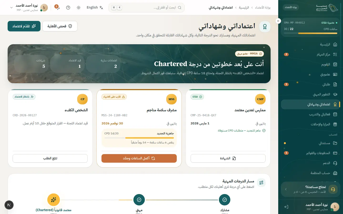
- 2Open this step
Eligibility pre-check
/portal/credentials
Screen: Credentials & certificates
- What the user does
- Runs the pre-check before applying.
- What the system shows
- Met and unmet criteria, each unmet one with a fix button.
Components used
- ReadinessChecklistBlockers, each with a direct action
Why here: The same pattern as renewal readiness.
States: Blocked · ready · all done enables CTA
- CpdProgressApproved vs required hours
Why here: Cross-checks CPD hours.
States: On track · pending · gap · complete
Features:
CRD-04 - 3Open this step
Applying
/portal/credentials/apply
Screen: Apply for a credential
- What the user does
- Completes the application and attaches evidence.
- What the system shows
- A stepped form with autosave.
Components used
- Stepper / VerticalStepperWhere the user is in the flow
Why here: Clear steps.
States: Done · current · upcoming · has problem
- FileUploadUpload or attach a verified document
Why here: Multiple evidence files.
States: Empty · dragging · uploading · done · rejected
- ErrorSummary + AutosaveIndicatorError summary and autosave
Why here: Autosave and error summary.
States: Saving · saved · offline · linked errors
UI states covered
- OfflineLocal save.
Features:
CRD-04APP-03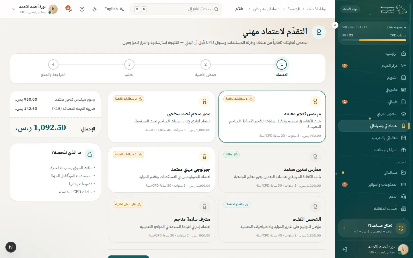
- 4Open this step
Interview and committee
/portal/credentials
Screen: Credentials & certificates
- What the user does
- Books an interview and follows the committee decision.
- What the system shows
- A timeline of stages with an upcoming date.
Components used
- TimelineRequest events with dates
Why here: Each stage and date.
States: Past · current pulses · upcoming
- NextStepPanelWho owns it? What do I do? When?
Why here: Shows who has the ball.
States: Waiting on me · waiting on SMA · done
- StatusBadgeStatus with colour, icon and text
Why here: Stage status.
States: Every dictionary status
Features:
CRD-05CRD-09 - 5Open this step
Certificate issued
/portal/credentials
Screen: Credentials & certificates
- What the user does
- Receives and shares the certificate.
- What the system shows
- A branded certificate with a unique number and QR.
Components used
- CertificatePreviewThe digital certificate
Why here: Print-ready A4 landscape.
States: Valid · revoked · expired
- SuccessMomentA big success moment
Why here: Issuance moment.
States: Success (gold dust) · calm under reduced motion
UI states covered
- SuccessA shareable verification link.
Features:
CRD-06CRD-10 - 6Open this step
Public verification
/verify
Screen: Verify a membership or certificate
- What the user does
- The employer verifies the certificate.
- What the system shows
- A minimal result without ID or mobile.
Components used
- VerificationSealPublic verification result
Why here: Revoked shows “revoked”, never “not found”.
States: Valid · revoked · expired · not found
UI states covered
- ErrorInvalid number: a friendly message.
Features:
PUB-09PUB-10CRD-07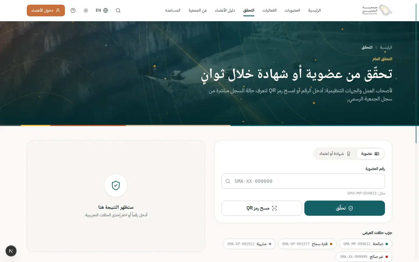
06 · #event
Attending an event
Register, QR ticket, check-in, evaluation and CPD credited automatically.
- Who
- Khalid wants to attend the Future Mining Forum.
- Goal
- Secure a seat and earn CPD hours.
- Entry point
- Events page or an invitation email.
- Success metric
- Attendance recorded and hours added without asking.
Effort vs reassurance
Pain points removed
- Registering twice (attendance, then CPD)
- Entrance queues
- Lost tickets
- 1Open this step
Event catalog
/events
Screen: Events & training
- What the user does
- Browses and filters by type and date.
- What the system shows
- Event cards with availability.
Components used
- EventCardAn event or course
Why here: Seat state visible on the card.
States: Open · full · waitlist · registered
- Choices (Radio / Chip / Segmented)Pick from a few options
Why here: Type and mode filters.
States: Selected · unselected · disabled · focus
- Breadcrumbs / Pagination / TabsWayfinding and paging
Why here: Pagination.
States: Active · disabled · first/last page
UI states covered
- EmptyNo results: suggest loosening filters.
- LoadingCard skeletons.
Features:
PUB-07TRN-02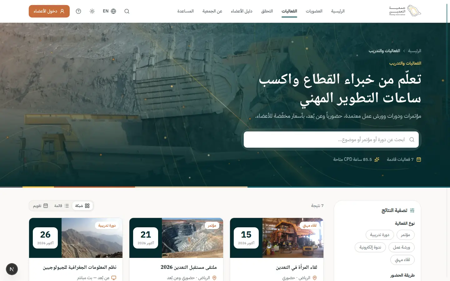
- 2Open this step
Event detail
/events/future-mining-forum
Screen: Event detail
- What the user does
- Reads agenda, fee and accredited hours.
- What the system shows
- Agenda, speakers, member vs non-member price.
Components used
UI states covered
- ErrorFull event: waitlist.
Features:
PUB-08TRN-02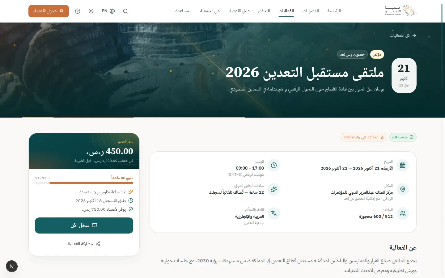
- 3Open this step
Registration sheet
/events/future-mining-forum
Screen: Event detail
- What the user does
- Confirms details and pays if required.
- What the system shows
- A sheet with summary, amount and confirm.
Components used
- Sheet / ConfirmDialogSecondary task without leaving the page
Why here: A sheet that keeps event context.
States: Closed · open · confirm for irreversible
- MoneySummary / AuditSummaryAmount, VAT and total
Why here: Fee and VAT are clear.
States: Before payment · paid · refunded
- notify (Toast)Quick confirmation with undo
Why here: Registration confirmation.
States: Success · error · with undo
UI states covered
- SuccessRegistered and ticket sent.
Features:
TRN-03TRN-04 - 4Open this step
QR ticket
/portal/events
Screen: My events & learning
- What the user does
- Opens the ticket on event day.
- What the system shows
- A ticket with a QR that works offline.
Components used
- MembershipCardDigital card with QR
Why here: The same signed-QR principle.
States: Active · expiring · expired · offline QR
- StatusBadgeStatus with colour, icon and text
Why here: “Registered” then “attended”.
States: Every dictionary status
UI states covered
- OfflineTicket stored for offline use.
Features:
TRN-03TRN-13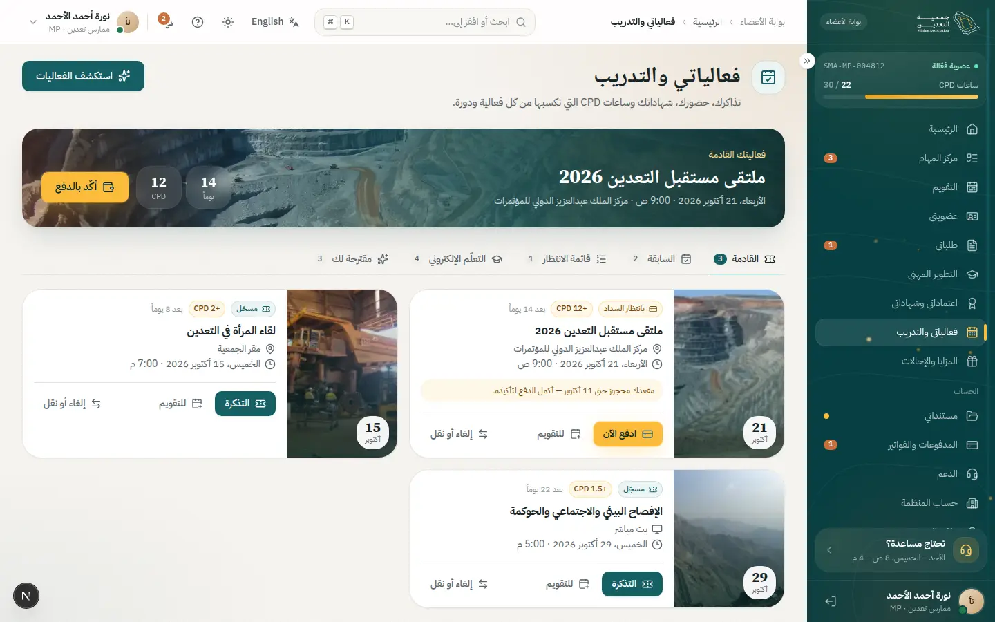
- 5Open this step
Check-in
/admin/events
Screen: Events & training
- What the user does
- Reception scans the QR.
- What the system shows
- An instant result greeting the attendee.
Components used
- StatCardA number with trend
Why here: Live attendance counter.
States: Up · down · flat · loading
- StatusBadgeStatus with colour, icon and text
Why here: Present / duplicate / unregistered.
States: Every dictionary status
UI states covered
- OfflineOffline mode syncs later.
Features:
TRN-07TRN-09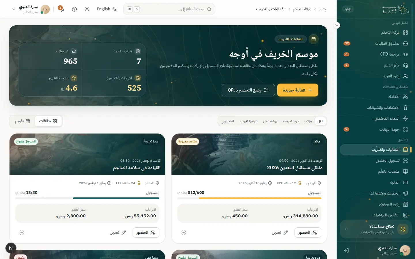
- 6Open this step
Evaluation
/portal/events
Screen: My events & learning
- What the user does
- Rates the event in a few taps.
- What the system shows
- A short evaluation form.
Components used
- Choices (Radio / Chip / Segmented)Pick from a few options
Why here: Visible-option rating.
States: Selected · unselected · disabled · focus
- Field / InputLabelled text fields with help
Why here: Optional comments.
States: Default · focus · error · disabled · read-only
UI states covered
- SuccessThanks and certificate unlocked.
Features:
TRN-11 - 7Open this step
CPD credited
/portal/cpd
Screen: CPD
- What the user does
- Finds the hours credited.
- What the system shows
- Event hours in the ledger as approved.
Components used
- CpdProgressApproved vs required hours
Why here: Progress rises.
States: On track · pending · gap · complete
- notify (Toast)Quick confirmation with undo
Why here: Notice of the credit.
States: Success · error · with undo
UI states covered
- SuccessAutomatic credit, no request.
Features:
TRN-12CPD-05
07 · #payment-failure
Payment failure and recovery
A failure never loses the request: clear message and a retry by another method.
- Who
- Khalid, whose card was declined by the bank.
- Goal
- Complete payment without redoing the request.
- Entry point
- Checkout during renewal.
- Success metric
- High completion on the second attempt.
Effort vs reassurance
Pain points removed
- Fear of double charges
- Technical error messages
- Losing the basket
- 1Open this step
Checkout
/portal/payments/checkout
Screen: Checkout
- What the user does
- Confirms payment.
- What the system shows
- Amount summary then hand-off to the gateway.
Components used
- MoneySummary / AuditSummaryAmount, VAT and total
Why here: The amount never changes between screens.
States: Before payment · paid · refunded
- ButtonPrimary and secondary actions
Why here: Loading state prevents double-click.
States: Default · hover · loading · disabled
UI states covered
- LoadingProcessing.
Features:
PAY-02PAY-03 - 2Open this step
The failure
/portal/payments/checkout
Screen: Checkout
- What the user does
- Returns from the gateway with a decline.
- What the system shows
- A plain reason and a confirmation that nothing was charged.
Components used
- AlertInline page alert
Why here: Error alert in human language.
States: Info · success · warning · error
- Skeleton / EmptyState / ErrorStateLoading, empty and error
Why here: ErrorState with a retry button.
States: Loading · empty · error with retry
UI states covered
- ErrorBank decline / session timeout / insufficient funds.
Features:
PAY-04 - 3Open this step
Recovery
/portal/payments/checkout
Screen: Checkout
- What the user does
- Switches method or retries.
- What the system shows
- The basket intact with alternative methods.
Components used
- Choices (Radio / Chip / Segmented)Pick from a few options
Why here: Payment methods as choices.
States: Selected · unselected · disabled · focus
- ButtonPrimary and secondary actions
Why here: One-tap retry.
States: Default · hover · loading · disabled
- notify (Toast)Quick confirmation with undo
Why here: Success confirmation.
States: Success · error · with undo
UI states covered
- SuccessPaid and receipt issued.
Features:
PAY-04PAY-05 - 4Open this step
History and receipt
/portal/payments
Screen: Payments & invoices
- What the user does
- Reviews attempts and the receipt.
- What the system shows
- A failed and a successful attempt with statuses.
Components used
- StatusBadgeStatus with colour, icon and text
Why here: Failed / paid.
States: Every dictionary status
- DataTableTable with views, filters and record sheet
Why here: Invoice list.
States: Loading · empty · multi-select · board
UI states covered
- EmptyNo payments yet.
Features:
PAY-08PAY-05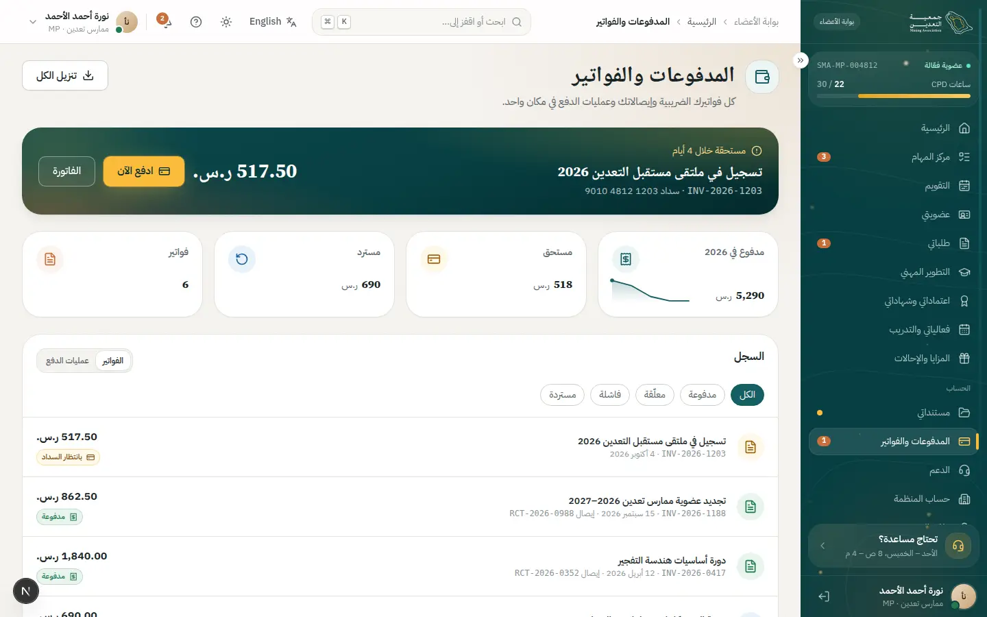
08 · #support
Getting support
Search first, open a ticket with suggestions, follow the thread, then rate.
- Who
- Noura cannot figure out how to upload a certain file type.
- Goal
- A fast fix without waiting.
- Entry point
- Help center or “Support” in the portal.
- Success metric
- High self-resolution and satisfaction at least 4/5.
Effort vs reassurance
Pain points removed
- Tickets for questions already answered
- Not knowing ticket status
- No satisfaction measure
- 1Open this step
Help search
/help
Screen: Help center
- What the user does
- Types her question in search.
- What the system shows
- Suggested articles and FAQs.
Components used
- Field / InputLabelled text fields with help
Why here: SearchInput with instant results.
States: Default · focus · error · disabled · read-only
- AccordionCollapsible Q&A
Why here: FAQs.
States: Collapsed · expanded
UI states covered
- EmptyNo results: an “Open a ticket” button.
Features:
PUB-12SUP-06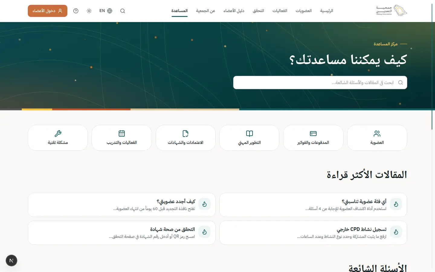
- 2Open this step
New ticket with suggestions
/portal/support
Screen: Support
- What the user does
- Types a title and similar articles appear.
- What the system shows
- A ticket sheet with live suggestions under the title.
Components used
- Sheet / ConfirmDialogSecondary task without leaving the page
Why here: A sheet that keeps her ticket list in view.
States: Closed · open · confirm for irreversible
- Select / Combobox / DatePickerReference values and Gregorian/Hijri dates
Why here: Category and priority from reference lists.
States: Empty · searching · results · no results
- FileUploadUpload or attach a verified document
Why here: A screenshot.
States: Empty · dragging · uploading · done · rejected
- ErrorSummary + AutosaveIndicatorError summary and autosave
Why here: Error summary.
States: Saving · saved · offline · linked errors
UI states covered
- SuccessTicket number and response time.
Features:
SUP-01SUP-02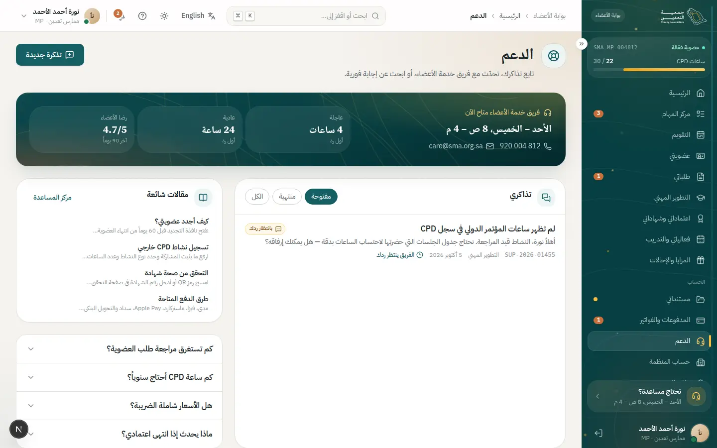
- 3Open this step
The thread
/portal/support
Screen: Support
- What the user does
- Exchanges replies with the agent.
- What the system shows
- A thread with “awaiting your reply” or “in progress”.
Components used
- TimelineRequest events with dates
Why here: Chronological messages.
States: Past · current pulses · upcoming
- StatusBadgeStatus with colour, icon and text
Why here: Status always visible.
States: Every dictionary status
UI states covered
- OfflineReply sends when back online.
Features:
SUP-03SUP-04 - 4Open this step
The ticket page
/portal/support/SUP-2026-01455
Screen: Support ticket
- What the user does
- Opens her ticket to see the whole thread and attachments.
- What the system shows
- Ticket number, status, owner and expected response time.
Components used
- TimelineRequest events with dates
Why here: Messages and events in order.
States: Past · current pulses · upcoming
- NextStepPanelWho owns it? What do I do? When?
Why here: Shows whether it is on her or on the association.
States: Waiting on me · waiting on SMA · done
- DocumentCardA document and its status
Why here: Attachments beside the thread.
States: Verified · in review · rejected · expired
UI states covered
- LoadingThread skeleton.
Features:
SUP-02SUP-05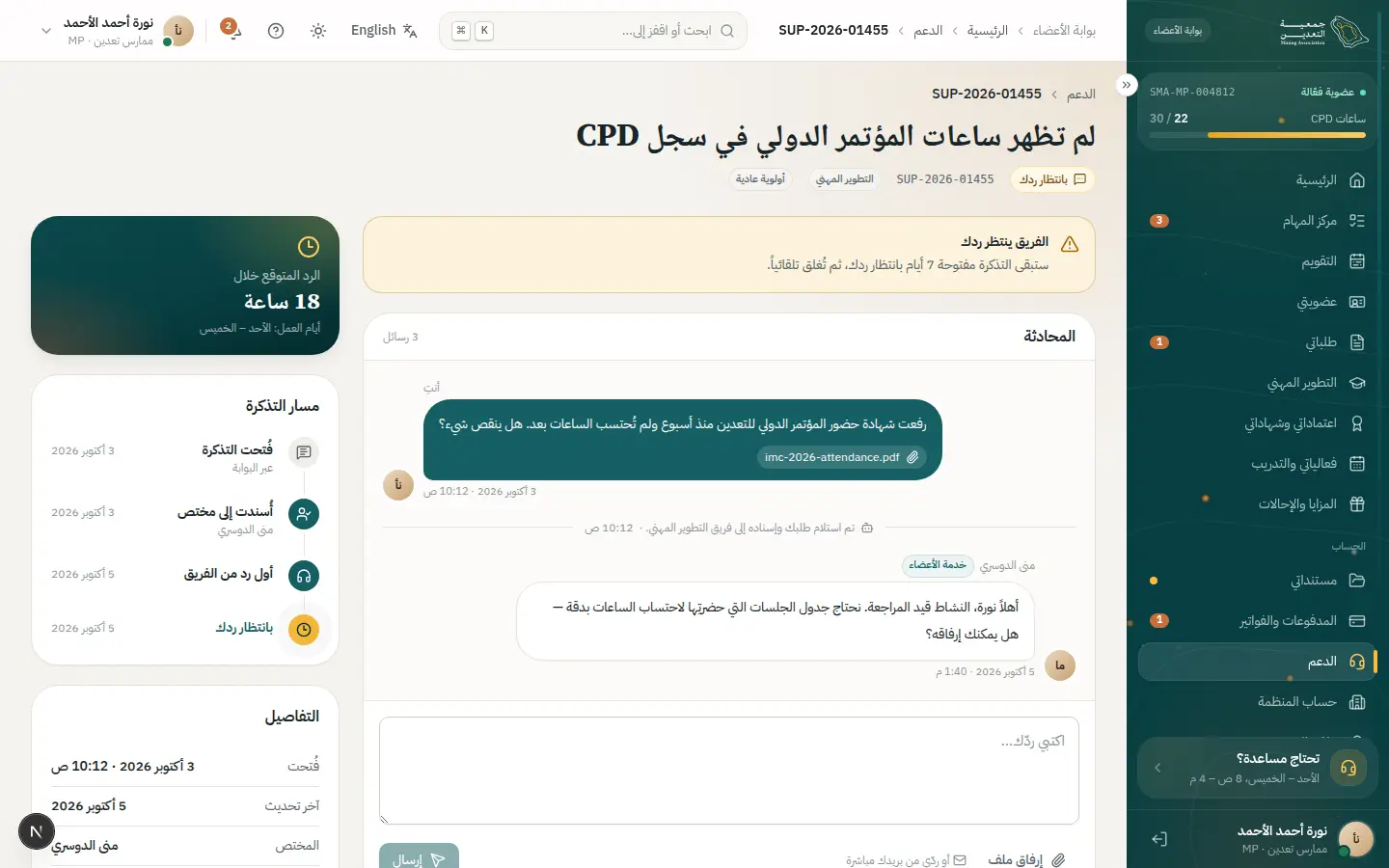
- 5Open this step
Satisfaction rating
/portal/support
Screen: Support
- What the user does
- Rates after resolution.
- What the system shows
- A star rating and optional note.
Components used
- Choices (Radio / Chip / Segmented)Pick from a few options
Why here: One-tap rating.
States: Selected · unselected · disabled · focus
- notify (Toast)Quick confirmation with undo
Why here: Thanks for rating.
States: Success · error · with undo
UI states covered
- SuccessTicket closed.
Features:
SUP-05
09 · #review
Reviewing a membership application
From the control room to a documented decision.
- Who
- Laila, an application reviewer.
- Goal
- Clear her daily queue accurately without missing SLAs.
- Entry point
- The control room in the morning.
- Success metric
- Low average review time and little rework.
Effort vs reassurance
Pain points removed
- Switching between systems
- Unclear priority
- Lost decision rationale
- 1Open this step
Control room
/admin
Screen: Control room
- What the user does
- Starts the day from the numbers.
- What the system shows
- Welcome banner, today's KPIs and requests nearing SLA.
Components used
- AdminBanner / Control roomWelcome and today's numbers
Why here: Welcome and service health.
States: Service health · today's numbers
- StatCardA number with trend
Why here: Numbers with trend.
States: Up · down · flat · loading
- Staff navPermission-filtered navigation
Why here: Navigation by her permissions.
States: Expanded · collapsed
UI states covered
- LoadingKPI skeletons.
Features:
STF-01STF-02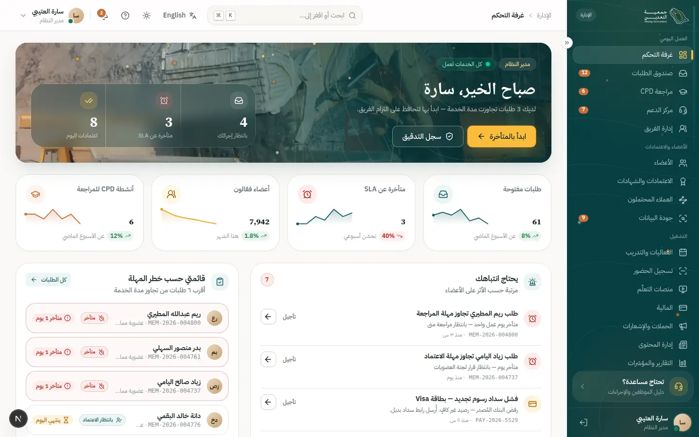
- 2Open this step
Request inbox
/admin/requests
Screen: Request inbox
- What the user does
- Applies a saved view and filters.
- What the system shows
- A table with views (mine, overdue…) and a board.
Components used
- DataTableTable with views, filters and record sheet
Why here: Views, filters and multi-select.
States: Loading · empty · multi-select · board
- StatusBadgeStatus with colour, icon and text
Why here: Unified statuses.
States: Every dictionary status
UI states covered
- EmptyNo matching requests.
- LoadingTable skeleton.
Features:
REV-02STF-04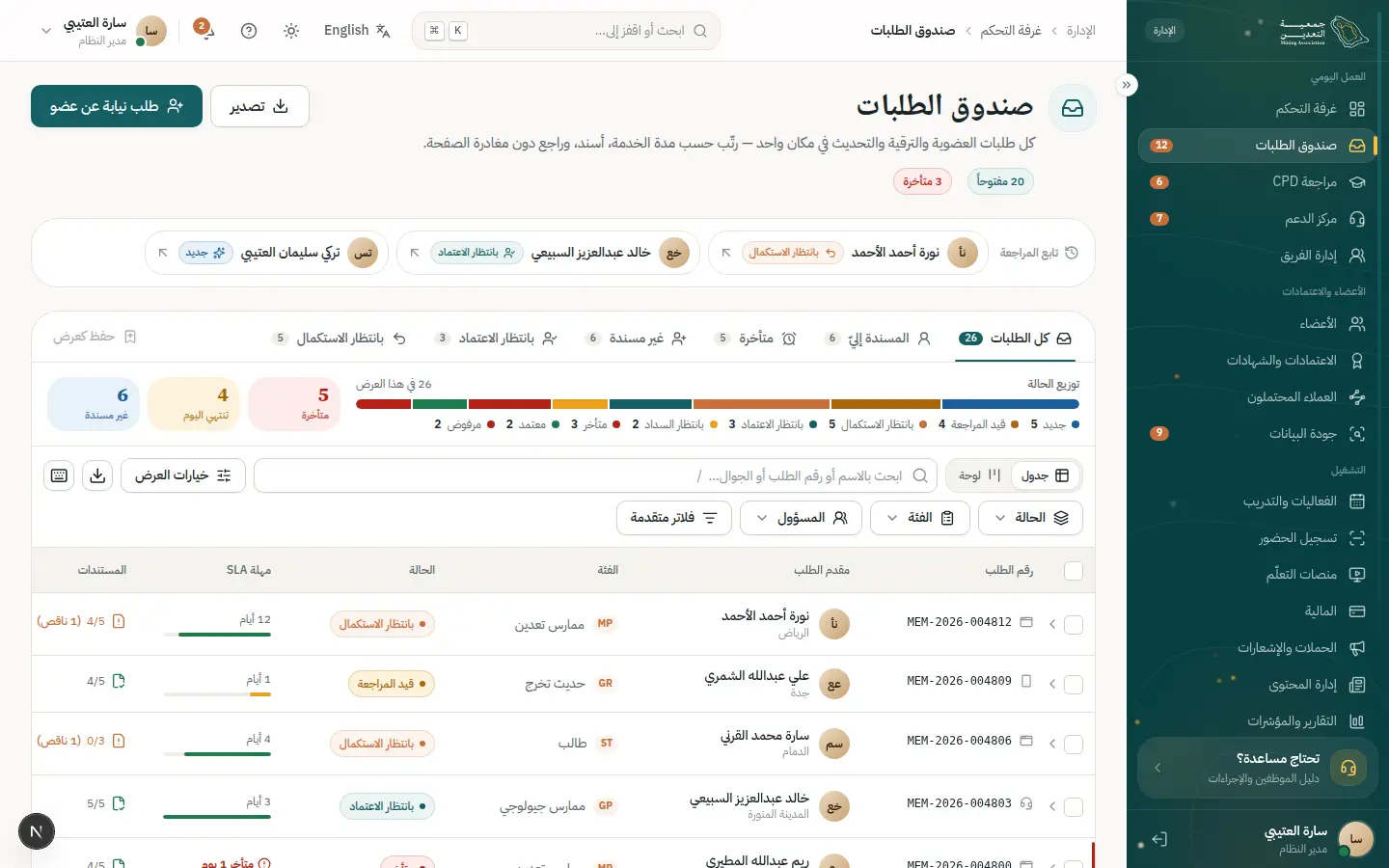
- 3Open this step
Balancing workload
/admin/team
Screen: Team
- What the user does
- Checks her queue is fair against colleagues and reassigns a request if needed.
- What the system shows
- Each reviewer's load, availability and requests nearing their SLA.
Components used
UI states covered
- EmptyNo unassigned requests.
Features:
STF-11REV-13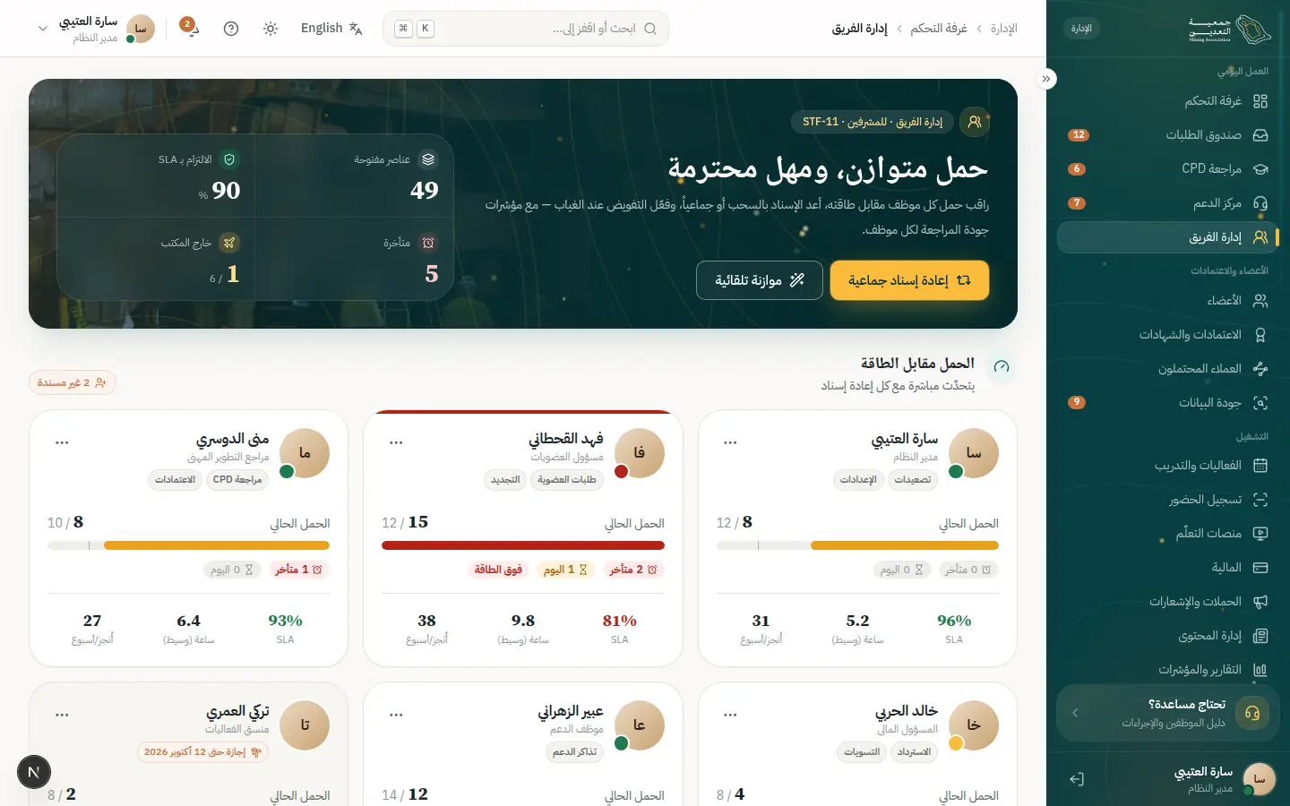
- 4Open this step
Record sheet
/admin/requests
Screen: Request inbox
- What the user does
- Peeks at a request without leaving the list.
- What the system shows
- Applicant summary and status.
Components used
- Sheet / ConfirmDialogSecondary task without leaving the page
Why here: Quick peek and record-to-record paging.
States: Closed · open · confirm for irreversible
- DataTableTable with views, filters and record sheet
Why here: The sheet is part of the table.
States: Loading · empty · multi-select · board
Features:
REV-03 - 5Open this step
Full review
/admin/requests/MEM-2026-004812
Screen: Request review
- What the user does
- Reviews data, checks and audit.
- What the system shows
- Data panel, documents, timeline and audit trail.
Components used
- TimelineRequest events with dates
Why here: Everything that happened.
States: Past · current pulses · upcoming
- DocumentCardA document and its status
Why here: Documents and states.
States: Verified · in review · rejected · expired
- MoneySummary / AuditSummaryAmount, VAT and total
Why here: AuditSummary before/after.
States: Before payment · paid · refunded
Features:
REV-04REV-05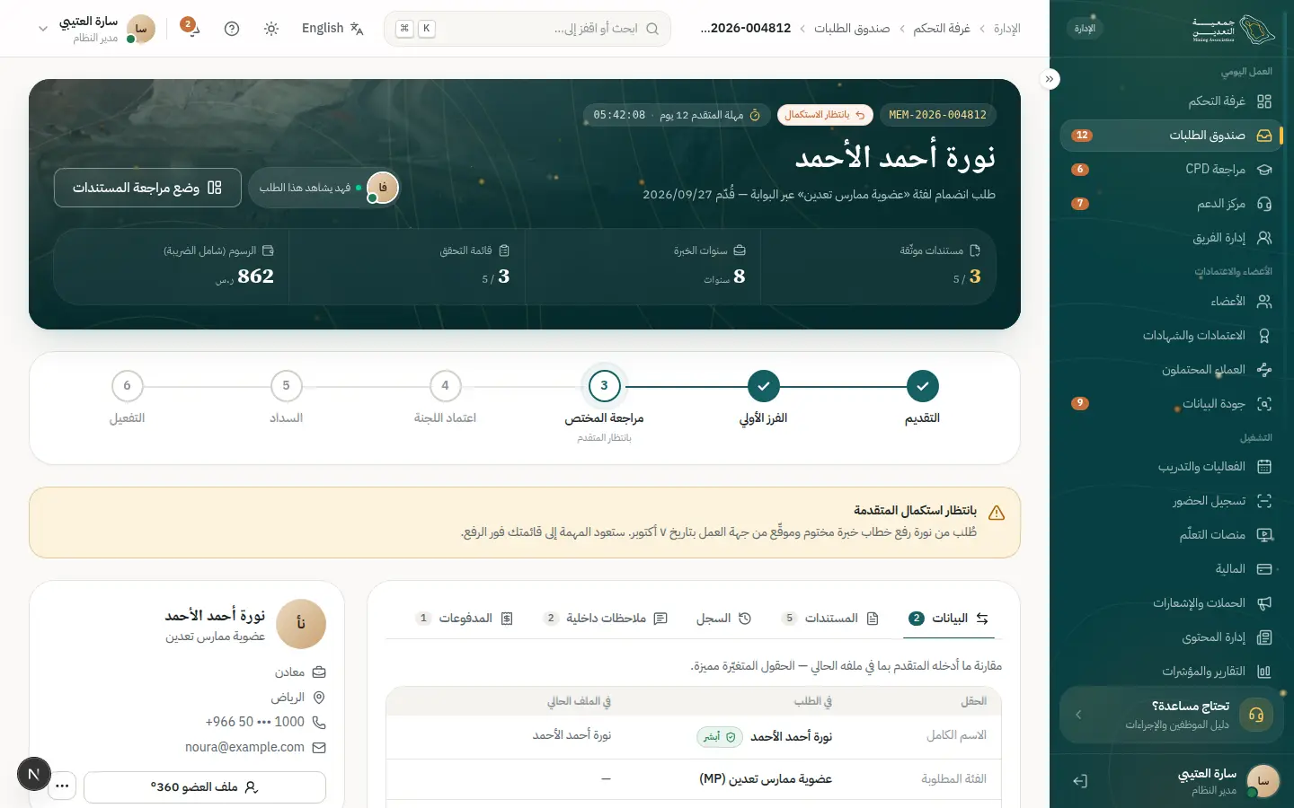
- 6Open this step
Document review mode
/admin/requests/MEM-2026-004812
Screen: Request review
- What the user does
- Inspects a document and accepts or rejects with a reason.
- What the system shows
- A large viewer with accept/reject and a reason.
Components used
- Sheet / ConfirmDialogSecondary task without leaving the page
Why here: The viewer sheet.
States: Closed · open · confirm for irreversible
- DocumentCardA document and its status
Why here: Document status updates.
States: Verified · in review · rejected · expired
- Field / InputLabelled text fields with help
Why here: Rejection reason is required.
States: Default · focus · error · disabled · read-only
UI states covered
- ErrorNo rejection without a reason.
Features:
REV-06REV-08 - 7Open this step
The decision
/admin/requests/MEM-2026-004812
Screen: Request review
- What the user does
- Requests correction, recommends or approves.
- What the system shows
- Decision confirmation, audit entry and member notice.
Components used
- Sheet / ConfirmDialogSecondary task without leaving the page
Why here: ConfirmDialog for rejection only.
States: Closed · open · confirm for irreversible
- notify (Toast)Quick confirmation with undo
Why here: Confirmation with undo.
States: Success · error · with undo
- StatusBadgeStatus with colour, icon and text
Why here: The new status.
States: Every dictionary status
UI states covered
- SuccessDecision recorded.
Features:
REV-07REV-09SEC-05
10 · #cpd-review
Reviewing CPD activities
A decision queue with proofs in front of you and one-tap decisions.
- Who
- Majid, the CPD officer.
- Goal
- Approve trusted activities fast and probe doubtful ones.
- Entry point
- “CPD review” in the nav.
- Success metric
- Decision time under 48 hours.
Effort vs reassurance
Pain points removed
- Scattered proofs
- Decisions without recorded reasons
- 1Open this step
The queue
/admin/cpd
Screen: CPD review
- What the user does
- Sorts by type and source.
- What the system shows
- Activities awaiting a decision with requested hours.
Components used
- DataTableTable with views, filters and record sheet
Why here: Filters and views.
States: Loading · empty · multi-select · board
- StatusBadgeStatus with colour, icon and text
Why here: Each activity's status.
States: Every dictionary status
UI states covered
- EmptyNothing waiting.
Features:
CPD-04 - 2Open this step
Proof sheet
/admin/cpd
Screen: CPD review
- What the user does
- Opens the proof and compares with the input.
- What the system shows
- Proof beside the entered data.
Components used
- Sheet / ConfirmDialogSecondary task without leaving the page
Why here: Proof and data side by side.
States: Closed · open · confirm for irreversible
- DocumentCardA document and its status
Why here: Document view.
States: Verified · in review · rejected · expired
Features:
CPD-04 - 3Open this step
The decision
/admin/cpd
Screen: CPD review
- What the user does
- Approves, adjusts hours or rejects with reason.
- What the system shows
- Status changes and the member is notified.
Components used
- notify (Toast)Quick confirmation with undo
Why here: Confirmation with undo.
States: Success · error · with undo
- StatusBadgeStatus with colour, icon and text
Why here: Approved / rejected.
States: Every dictionary status
UI states covered
- SuccessApproved and notified.
Features:
CPD-09CPD-08
11 · #finance-close
Closing the finance day
Payments, reconciliation, maker–checker refunds, then close.
- Who
- Hind, the association accountant.
- Goal
- Close the day with exact reconciliation and documented entries.
- Entry point
- “Finance” at end of day.
- Success metric
- Zero unexplained differences.
Effort vs reassurance
Pain points removed
- Manual reconciliation
- Refunds without control
- 1Open this step
Payments
/admin/finance
Screen: Finance
- What the user does
- Reviews today's payments.
- What the system shows
- Finance KPIs and a transactions table.
Components used
- StatCardA number with trend
Why here: Today's totals.
States: Up · down · flat · loading
- DataTableTable with views, filters and record sheet
Why here: Filterable transactions.
States: Loading · empty · multi-select · board
- StatusBadgeStatus with colour, icon and text
Why here: Paid / failed / refunded.
States: Every dictionary status
UI states covered
- LoadingSkeletons.
Features:
PAY-09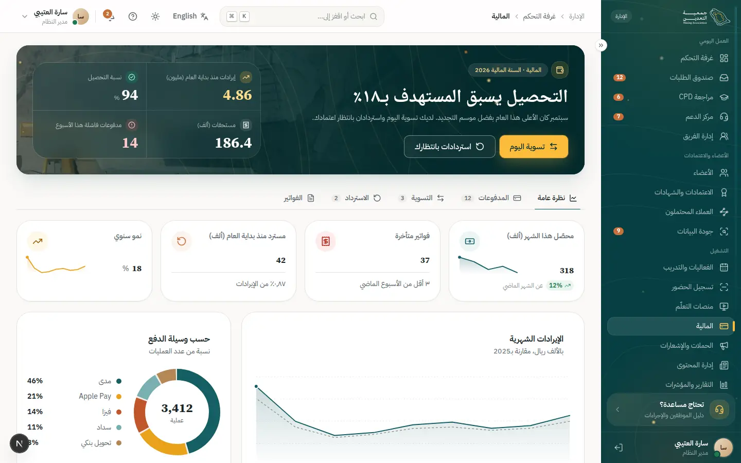
- 2Open this step
Reconciliation
/admin/finance
Screen: Finance
- What the user does
- Matches against the gateway statement.
- What the system shows
- Highlighted differences and suggested causes.
Components used
UI states covered
- SuccessFully reconciled.
Features:
PAY-10 - 3Open this step
Refund (maker–checker)
/admin/finance
Screen: Finance
- What the user does
- The maker requests, the checker approves.
- What the system shows
- A refund sheet and final confirmation.
Components used
- Sheet / ConfirmDialogSecondary task without leaving the page
Why here: ConfirmDialog for the irreversible step.
States: Closed · open · confirm for irreversible
- MoneySummary / AuditSummaryAmount, VAT and total
Why here: Amount and audit.
States: Before payment · paid · refunded
- StatusBadgeStatus with colour, icon and text
Why here: Awaiting approval.
States: Every dictionary status
UI states covered
- ErrorA maker cannot approve their own request.
Features:
PAY-11SEC-05 - 4Open this step
Close the day
/admin/finance
Screen: Finance
- What the user does
- Closes the day after reconciling.
- What the system shows
- A summary and confirmation.
Components used
- SuccessMomentA big success moment
Why here: Close confirmation.
States: Success (gold dust) · calm under reduced motion
- MoneySummary / AuditSummaryAmount, VAT and total
Why here: Day summary.
States: Before payment · paid · refunded
UI states covered
- SuccessClosed with a downloadable report.
Features:
PAY-10RPT-01
12 · #checkin
Event check-in (kiosk mode)
Fast, unmistakable scanning even offline.
- Who
- Reception staff on event day.
- Goal
- Admit hundreds without a queue.
- Entry point
- “Events” then kiosk mode.
- Success metric
- Under 3 seconds per attendee.
Effort vs reassurance
Pain points removed
- Poor hall connectivity
- Duplicate entries
- 1Open this step
Pick the event
/admin/events
Screen: Events & training
- What the user does
- Chooses today's event.
- What the system shows
- Events with registrant counts.
Components used
Features:
TRN-09 - 2Open this step
Kiosk mode
/admin/events
Screen: Events & training
- What the user does
- Enters a big scanning screen.
- What the system shows
- A simple screen with the attendance counter.
Components used
UI states covered
- OfflineWorks offline and syncs later.
Features:
TRN-07 - 3Open this step
Scan result
/admin/events
Screen: Events & training
- What the user does
- Scans each attendee's QR.
- What the system shows
- Colour, text and result: welcome / duplicate / unregistered.
Components used
- StatusBadgeStatus with colour, icon and text
Why here: Result in text and icon.
States: Every dictionary status
- notify (Toast)Quick confirmation with undo
Why here: Instant feedback.
States: Success · error · with undo
UI states covered
- SuccessAttendance recorded.
- ErrorInvalid code.
Features:
TRN-07TRN-08
13 · #configure
Configuring the platform
Categories, forms, workflows and roles, with no developer.
- Who
- The association's system administrator.
- Goal
- Add a new category with its form, review flow and permissions.
- Entry point
- “Settings”.
- Success metric
- A new category live within an hour.
Effort vs reassurance
Pain points removed
- Developer dependency for every change
- Fear of breaking a live flow
- 1Open this step
Categories
/admin/settings
Screen: Settings
- What the user does
- Adds a category and sets its fees.
- What the system shows
- A category list and each one's settings.
Components used
- CategoryCardMembership category card
Why here: Previews the category card as visitors see it.
States: Default · recommended · selected to compare
- Field / InputLabelled text fields with help
Why here: Config fields.
States: Default · focus · error · disabled · read-only
- Choices (Radio / Chip / Segmented)Pick from a few options
Why here: Enable switches.
States: Selected · unselected · disabled · focus
Features:
ADM-01ADM-02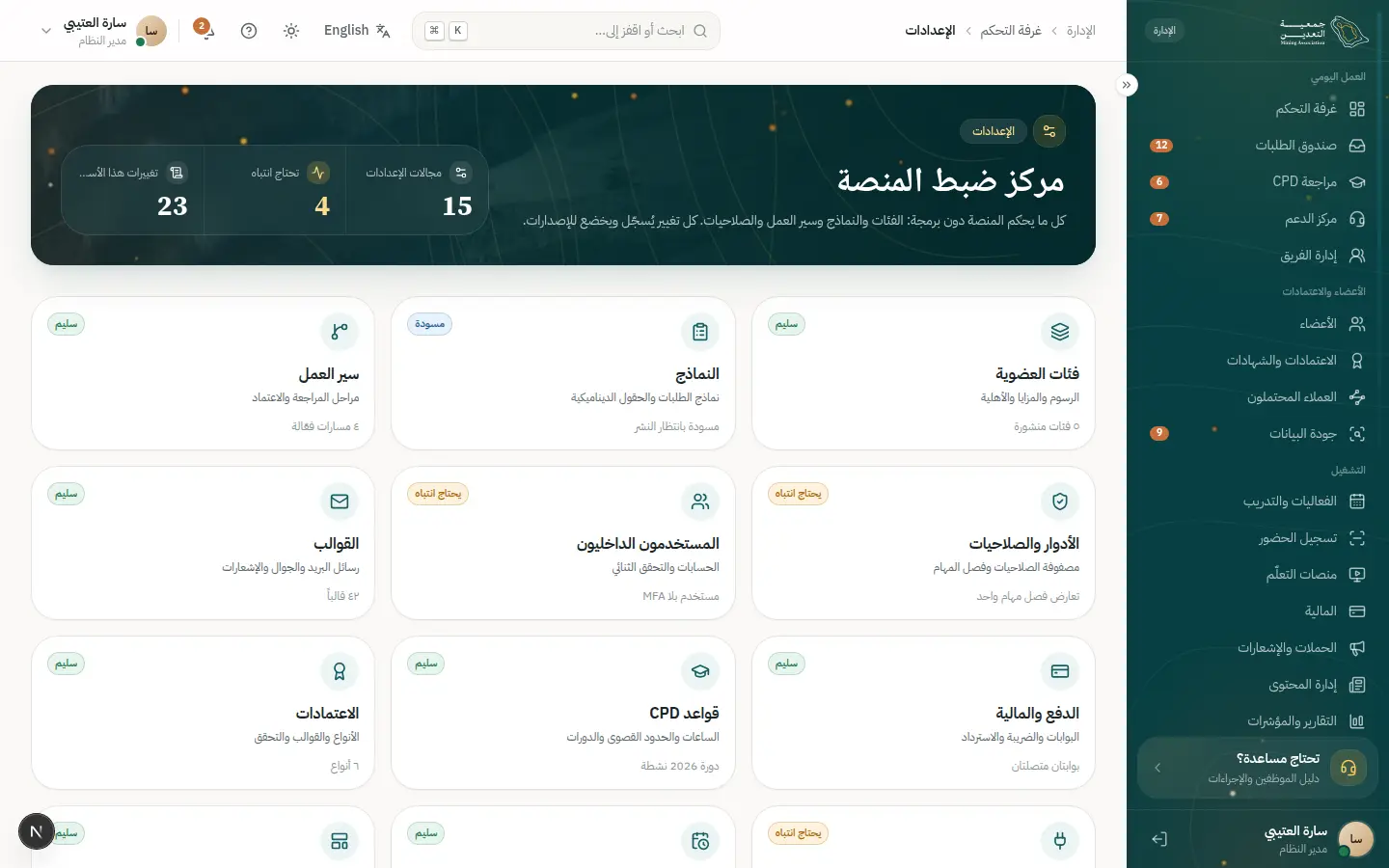
- 2Open this step
Form builder
/admin/settings/forms
Screen: Form builder
- What the user does
- Drags fields and sets conditions.
- What the system shows
- A builder with live preview.
Components used
- Field / InputLabelled text fields with help
Why here: Field specimens.
States: Default · focus · error · disabled · read-only
- Select / Combobox / DatePickerReference values and Gregorian/Hijri dates
Why here: Reference data sources.
States: Empty · searching · results · no results
- Sheet / ConfirmDialogSecondary task without leaving the page
Why here: Field properties sheet.
States: Closed · open · confirm for irreversible
UI states covered
- SuccessDraft saved and versioned.
Features:
ADM-03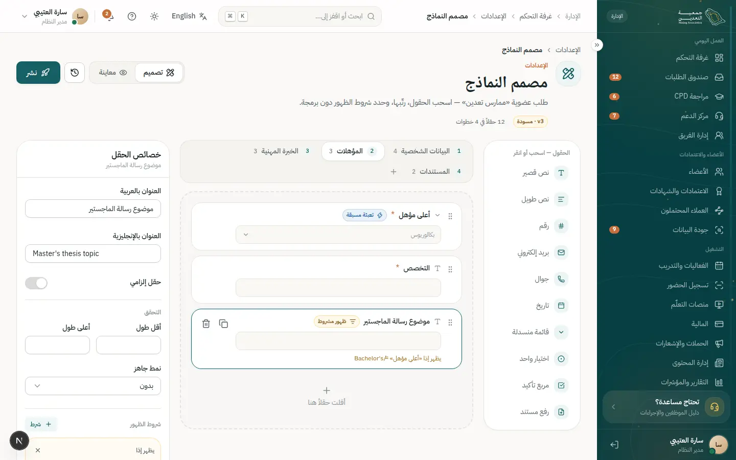
- 3Open this step
Workflow designer
/admin/settings/workflows
Screen: Workflow designer
- What the user does
- Draws review stages and owners.
- What the system shows
- Stages with SLAs and escalation.
Components used
- Stepper / VerticalStepperWhere the user is in the flow
Why here: Stage representation.
States: Done · current · upcoming · has problem
- StatusBadgeStatus with colour, icon and text
Why here: Stage statuses.
States: Every dictionary status
- AlertInline page alert
Why here: Warns when live requests are affected.
States: Info · success · warning · error
Features:
ADM-04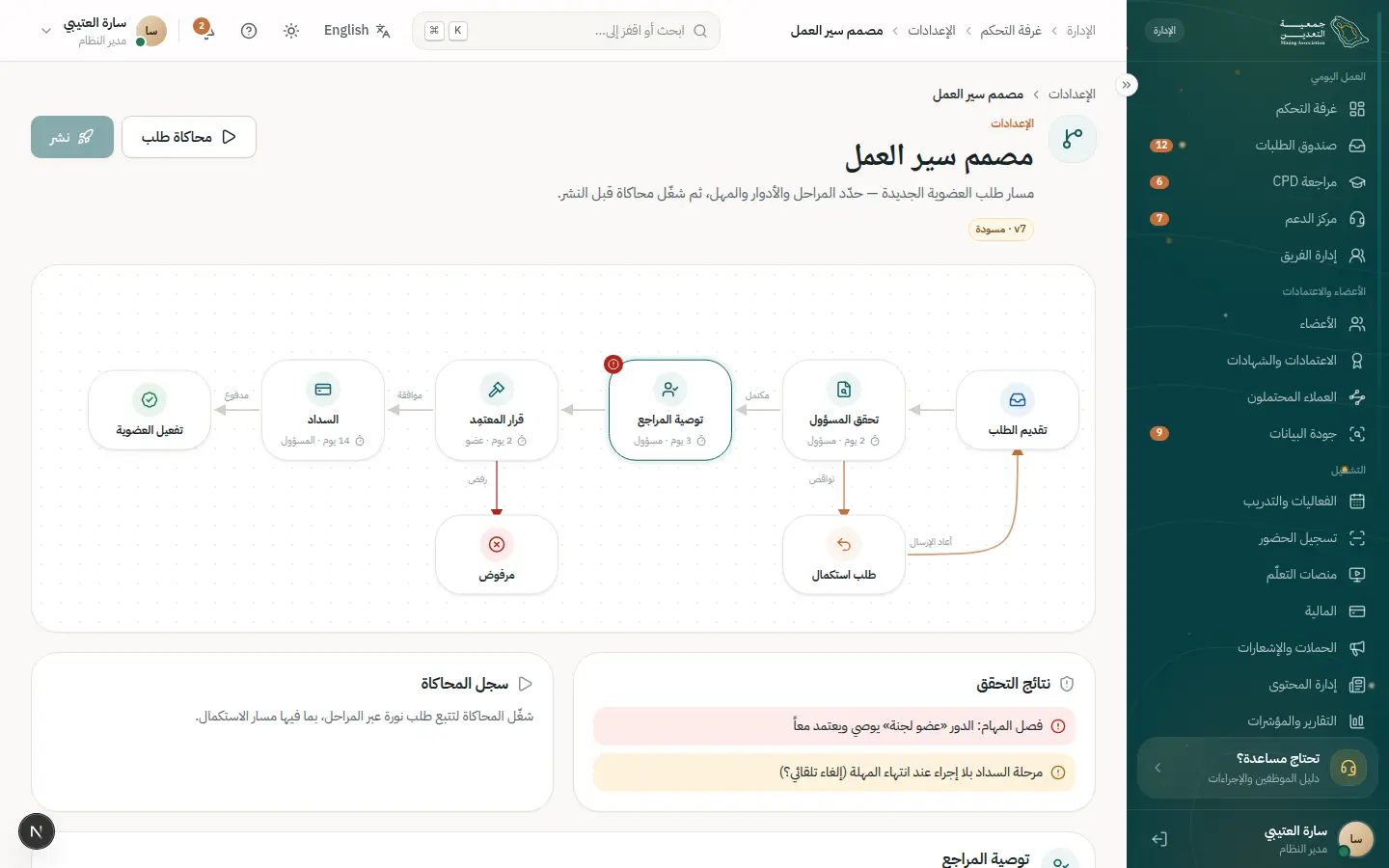
- 4Open this step
Roles and permissions
/admin/settings/roles
Screen: Roles & permissions
- What the user does
- Grants roles precise permissions.
- What the system shows
- A permission matrix and its effect on nav.
Components used
- DataTableTable with views, filters and record sheet
Why here: Role matrix.
States: Loading · empty · multi-select · board
- Choices (Radio / Chip / Segmented)Pick from a few options
Why here: Permission checkboxes.
States: Selected · unselected · disabled · focus
- Staff navPermission-filtered navigation
Why here: The nav filters by permission.
States: Expanded · collapsed
UI states covered
- SuccessSaved with an audit entry.
Features:
ADM-05ADM-06SEC-05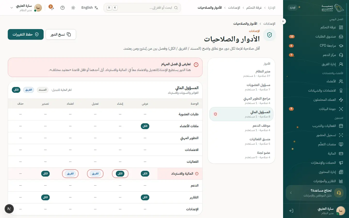
14 · #verify
Verifying a card or certificate
An outside party confirms in seconds with no account.
- Who
- A hiring manager at a mining company.
- Goal
- Confirm a candidate's credential is genuine.
- Entry point
- Scanning a QR or typing the number in “Verify”.
- Success metric
- Result in seconds with minimal data.
Effort vs reassurance
Pain points removed
- Phoning the association
- Forged certificates
- 1Open this step
Enter or scan
/verify
Screen: Verify a membership or certificate
- What the user does
- Types the number or scans the QR.
- What the system shows
- One field and a verify button.
Components used
- Field / InputLabelled text fields with help
Why here: A certificate-number field.
States: Default · focus · error · disabled · read-only
- ButtonPrimary and secondary actions
Why here: Verify button.
States: Default · hover · loading · disabled
UI states covered
- LoadingVerifying.
Features:
PUB-09 - 2Open this step
The result
/verify
Screen: Verify a membership or certificate
- What the user does
- Reads the result.
- What the system shows
- Name, category and validity only; no ID or mobile.
Components used
- VerificationSealPublic verification result
Why here: Minimal-data result.
States: Valid · revoked · expired · not found
- StatusBadgeStatus with colour, icon and text
Why here: Valid / expired.
States: Every dictionary status
UI states covered
- SuccessValid.
- ErrorNot found.
Features:
PUB-09PUB-10 - 3Open this step
Revoked case
/verify
Screen: Verify a membership or certificate
- What the user does
- Tries a revoked certificate.
- What the system shows
- A clear “revoked” with a generic reason.
Components used
- VerificationSealPublic verification result
Why here: Revoked ≠ not found.
States: Valid · revoked · expired · not found
- AlertInline page alert
Why here: A notice for the checker.
States: Info · success · warning · error
UI states covered
- ErrorRevoked.
Features:
CRD-07
15 · #upgrade
Upgrading membership category
Compare, see the difference, pay and get the new card at once.
- Who
- Salman, a graduate member who now qualifies as a practitioner.
- Goal
- Upgrade without losing the remaining term.
- Entry point
- An upgrade suggestion in “My membership”.
- Success metric
- Upgrade completed in under 5 minutes.
Effort vs reassurance
Pain points removed
- Not knowing the fee difference
- Fear of paying the term twice
- Waiting for the new card
- 1Open this step
The upgrade suggestion
/portal/membership
Screen: My membership
- What the user does
- Sees he is eligible for a higher category.
- What the system shows
- His current card and a calm “You can upgrade” alert.
Components used
- MembershipCardDigital card with QR
Why here: Reminds him of his current category before comparing.
States: Active · expiring · expired · offline QR
- AlertInline page alert
Why here: An informative, not pushy, alert.
States: Info · success · warning · error
Features:
LIF-02LIF-08 - 2Open this step
Comparing categories
/portal/membership/upgrade
Screen: Upgrade / change category
- What the user does
- Compares his category with the higher one and picks it.
- What the system shows
- Two side-by-side cards with criteria, benefits and the fee difference.
Components used
- CategoryCardMembership category card
Why here: The same category cards for easy understanding.
States: Default · recommended · selected to compare
- Choices (Radio / Chip / Segmented)Pick from a few options
Why here: Pick the target in one tap.
States: Selected · unselected · disabled · focus
UI states covered
- EmptyNo higher category: explains why.
Features:
LIF-08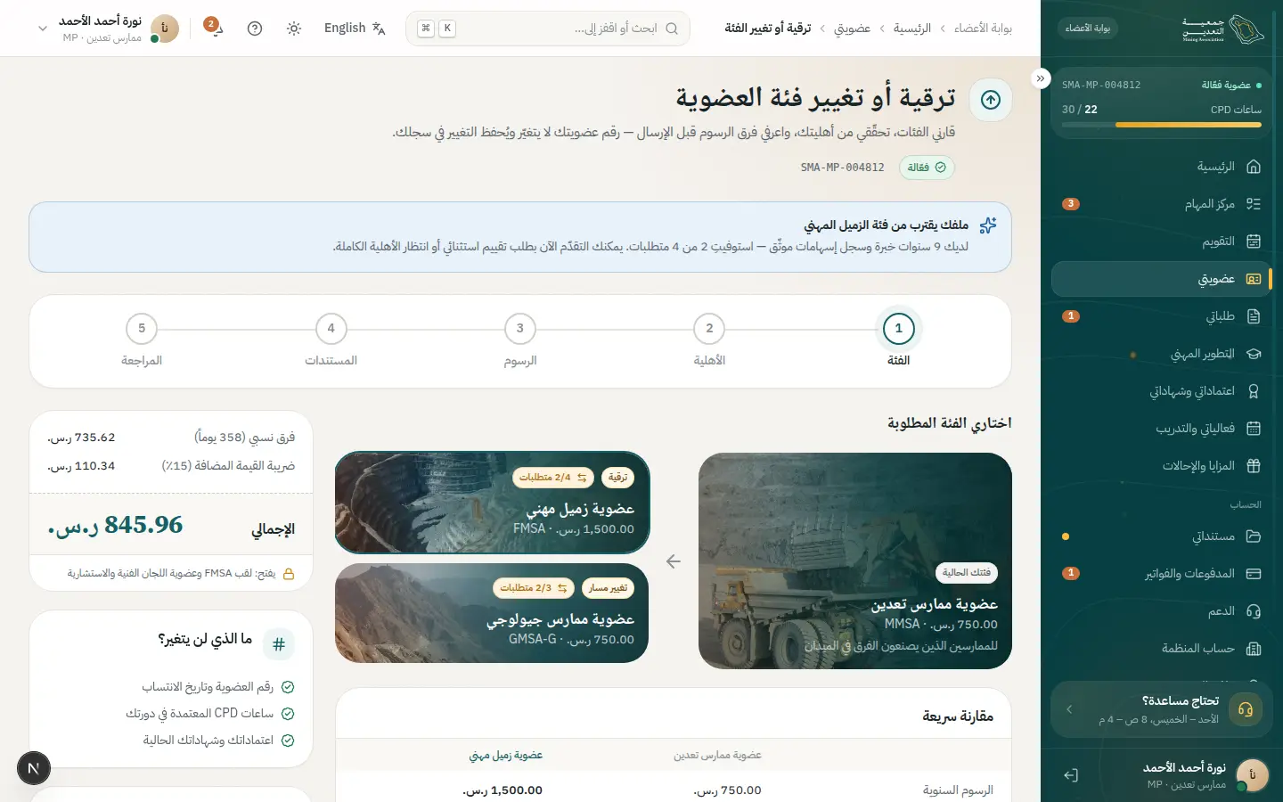
- 3Open this step
Eligibility and documents
/portal/membership/upgrade
Screen: Upgrade / change category
- What the user does
- Confirms he meets the criteria and attaches what is missing.
- What the system shows
- A criteria list with a button for each gap.
Components used
- ReadinessChecklistBlockers, each with a direct action
Why here: Blockers visible before payment.
States: Blocked · ready · all done enables CTA
- FileUploadUpload or attach a verified document
Why here: Upload the experience proof in place.
States: Empty · dragging · uploading · done · rejected
UI states covered
- ErrorRejected document: clear reason and re-upload.
Features:
LIF-08APP-04 - 4Open this step
Paying the difference only
/portal/payments/checkout
Screen: Checkout
- What the user does
- Reviews the amount and confirms payment.
- What the system shows
- A summary that credits the remaining term and shows VAT and total.
Components used
- MoneySummary / AuditSummaryAmount, VAT and total
Why here: The credit is itemised so there are no surprises.
States: Before payment · paid · refunded
- ButtonPrimary and secondary actions
Why here: A pay button with a loading state.
States: Default · hover · loading · disabled
UI states covered
- ErrorPayment failed: see the payment-failure journey.
Features:
PAY-02LIF-08 - 5Open this step
The new card
/portal/membership
Screen: My membership
- What the user does
- Returns to his membership and finds the new category.
- What the system shows
- A card with the new category, a fresh QR and a receipt.
Components used
- MembershipCardDigital card with QR
Why here: Updates instantly.
States: Active · expiring · expired · offline QR
- SuccessMomentA big success moment
Why here: An upgrade confirmation moment.
States: Success (gold dust) · calm under reduced motion
UI states covered
- SuccessEmail notice and PDF receipt.
Features:
LIF-01LIF-08
16 · #corporate
Organization account and seats
An HR manager manages the company's seats and pays one invoice.
- Who
- Reem, HR manager at a mining firm with 12 member engineers.
- Goal
- Add a new employee and pay the organization invoice in one go.
- Entry point
- “Organization account” in the portal.
- Success metric
- A new seat live and the invoice paid in one session.
Effort vs reassurance
Pain points removed
- Chasing each employee's renewal
- Many scattered invoices
- Not knowing free seats
- 1Open this step
Organization overview
/portal/organization
Screen: Organization account
- What the user does
- Reviews used and available seats.
- What the system shows
- Seat KPIs and the expiry dates of the company's members.
Components used
UI states covered
- LoadingTable skeleton while loading.
Features:
LIF-09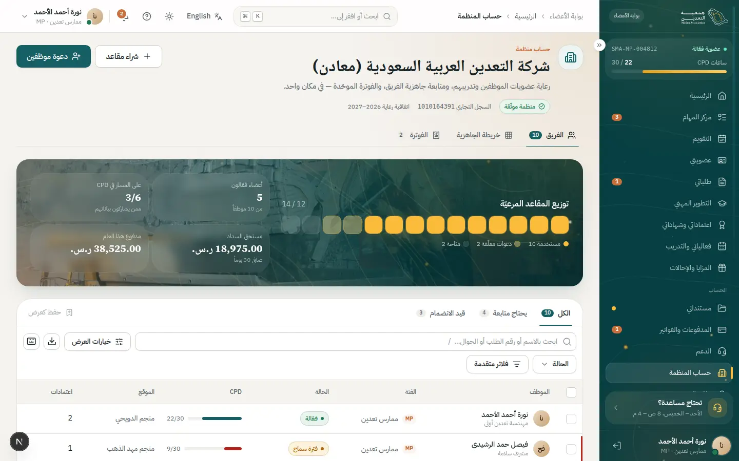
- 2Open this step
Inviting an employee
/portal/organization
Screen: Organization account
- What the user does
- Enters the employee's email and assigns a seat.
- What the system shows
- An invite sheet with email and membership category.
Components used
- Sheet / ConfirmDialogSecondary task without leaving the page
Why here: A sheet that keeps the members list in view.
States: Closed · open · confirm for irreversible
- Field / InputLabelled text fields with help
Why here: Instant email validation.
States: Default · focus · error · disabled · read-only
- notify (Toast)Quick confirmation with undo
Why here: Invite-sent confirmation with undo.
States: Success · error · with undo
UI states covered
- ErrorNo seats left: suggest buying more.
Features:
LIF-09 - 3Open this step
Removing or moving a seat
/portal/organization
Screen: Organization account
- What the user does
- Frees a departed employee's seat and reassigns it.
- What the system shows
- A confirm dialog explaining the effect on the membership.
Components used
- Sheet / ConfirmDialogSecondary task without leaving the page
Why here: Confirmation for an irreversible action.
States: Closed · open · confirm for irreversible
- StatusBadgeStatus with colour, icon and text
Why here: Seat status: active / freed.
States: Every dictionary status
Features:
LIF-09 - 4Open this step
The organization invoice
/portal/payments
Screen: Payments & invoices
- What the user does
- Opens the consolidated invoice and reviews its lines.
- What the system shows
- A line per member, VAT, total and a pay or bank-transfer option.
Components used
- MoneySummary / AuditSummaryAmount, VAT and total
Why here: Total and breakdown are clear.
States: Before payment · paid · refunded
- DataTableTable with views, filters and record sheet
Why here: Invoice lines with sort and filter.
States: Loading · empty · multi-select · board
- StatusBadgeStatus with colour, icon and text
Why here: Due / paid.
States: Every dictionary status
UI states covered
- EmptyNo invoices due.
Features:
PAY-12PAY-08 - 5Open this step
Paying and the receipt
/portal/payments/checkout
Screen: Checkout
- What the user does
- Pays the invoice and downloads the tax receipt.
- What the system shows
- Payment confirmation and a receipt with the organization name and VAT number.
Components used
- ButtonPrimary and secondary actions
Why here: A loading state blocks double-clicks.
States: Default · hover · loading · disabled
- SuccessMomentA big success moment
Why here: A confirmation moment.
States: Success (gold dust) · calm under reduced motion
UI states covered
- SuccessAll covered seats renewed.
Features:
PAY-02PAY-05PAY-12
17 · #referral
Using benefits and referring a colleague
Use your benefits, invite a colleague and track your reward.
- Who
- Majda, a practitioner member who wants to invite her colleague Hala.
- Goal
- Use the discounts and share a referral link.
- Entry point
- “Benefits & referrals” in the portal.
- Success metric
- At least one completed referral per active member a year.
Effort vs reassurance
Pain points removed
- Not knowing what benefits exist
- Copying discount codes by hand
- Unclear referral outcome
- 1Open this step
Membership benefits
/portal/benefits
Screen: Benefits & referrals
- What the user does
- Browses partner discounts and activates what suits her.
- What the system shows
- Benefit cards with a discount code and a “Copy” button.
Components used
- CategoryCardMembership category card
Why here: Cards in a familiar pattern.
States: Default · recommended · selected to compare
- ButtonPrimary and secondary actions
Why here: Copy the code in a tap.
States: Default · hover · loading · disabled
- notify (Toast)Quick confirmation with undo
Why here: Copy confirmation.
States: Success · error · with undo
UI states covered
- EmptyNo benefits for her category yet.
Features:
LIF-10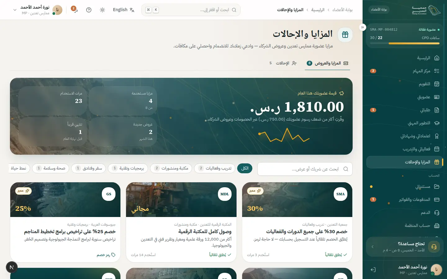
- 2Open this step
The referral link
/portal/benefits
Screen: Benefits & referrals
- What the user does
- Copies her personal link or emails it.
- What the system shows
- A unique link plus an invitations and rewards counter.
Components used
- Field / InputLabelled text fields with help
Why here: A read-only field with a copy button.
States: Default · focus · error · disabled · read-only
- StatCardA number with trend
Why here: Invited and completed counts.
States: Up · down · flat · loading
Features:
LIF-11 - 3Open this step
The colleague joins
/register
Screen: Create account
- What the user does
- Hala opens the link and creates her account.
- What the system shows
- A sign-up page mentioning who invited her.
Components used
- Field / InputLabelled text fields with help
Why here: A short form.
States: Default · focus · error · disabled · read-only
- OtpInputSegmented verification code
Why here: Mobile verification.
States: Entry · error (shake) · resend countdown · success
- AlertInline page alert
Why here: A “Majda invited you” alert.
States: Info · success · warning · error
UI states covered
- ErrorWrong verification code.
Features:
IAM-01LIF-11 - 4Open this step
The reward
/portal/benefits
Screen: Benefits & referrals
- What the user does
- Majda tracks the referral status.
- What the system shows
- Status moving from “signed up” to “joined” and the reward credited.
Components used
- StatusBadgeStatus with colour, icon and text
Why here: Referral status in text and colour.
States: Every dictionary status
- TimelineRequest events with dates
Why here: Referral stages with dates.
States: Past · current pulses · upcoming
- SuccessMomentA big success moment
Why here: The reward moment.
States: Success (gold dust) · calm under reduced motion
UI states covered
- SuccessA credit or discount on the next renewal.
Features:
LIF-11NTF-03
18 · #pay-link
Paying through a link
Staff create a link and the customer pays without an account.
- Who
- Hind from finance, and Fahad, a non-member who wants to pay a course fee.
- Goal
- Collect a payment without creating an account for the customer.
- Entry point
- “Finance settings” for staff, an SMS for the customer.
- Success metric
- A link paid within 24 hours with no follow-up.
Effort vs reassurance
Pain points removed
- Forcing the customer to register
- Bank transfers hard to match
- Links expiring unnoticed
- 1Open this step
Generating the link
/admin/settings/finance
Screen: Finance settings
- What the user does
- Sets the amount, purpose and link validity.
- What the system shows
- A form with amount, description and expiry, then a ready link to copy.
Components used
- Field / InputLabelled text fields with help
Why here: Amount and description fields.
States: Default · focus · error · disabled · read-only
- Select / Combobox / DatePickerReference values and Gregorian/Hijri dates
Why here: The expiry date.
States: Empty · searching · results · no results
- notify (Toast)Quick confirmation with undo
Why here: Link-copied confirmation.
States: Success · error · with undo
UI states covered
- ErrorInvalid amount.
Features:
PAY-06ADM-09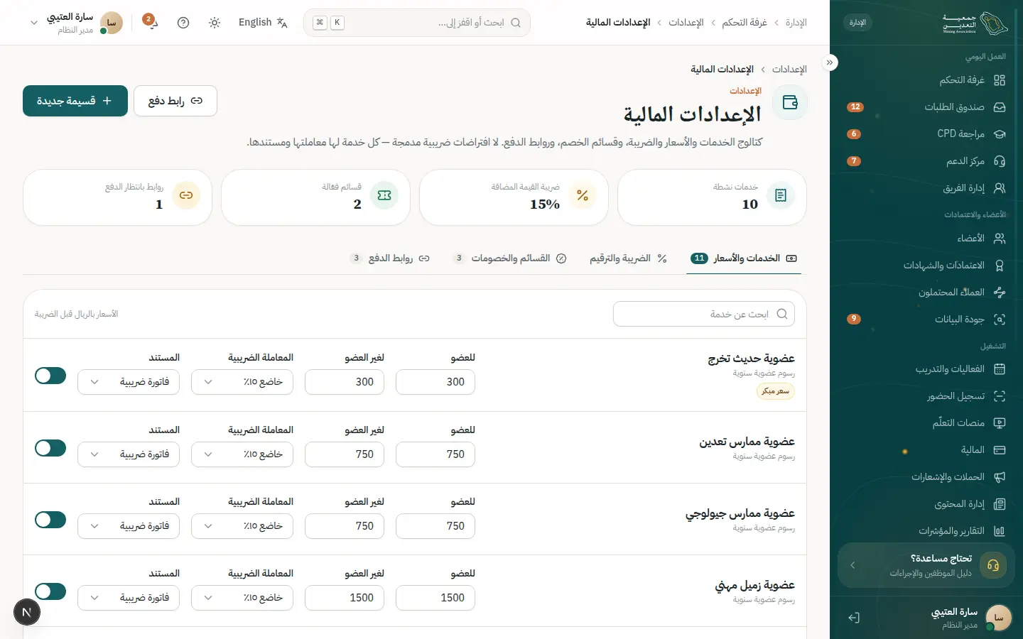
- 2Open this step
Sending the link
/admin/settings/finance
Screen: Finance settings
- What the user does
- Sends it by SMS or email.
- What the system shows
- A link log with status: sent / paid / expired.
Components used
- DataTableTable with views, filters and record sheet
Why here: Links list with filters.
States: Loading · empty · multi-select · board
- StatusBadgeStatus with colour, icon and text
Why here: Clear link status.
States: Every dictionary status
UI states covered
- EmptyNo links yet.
Features:
PAY-06NTF-02 - 3Open this step
The payment page
/pay/PL-7Q4K2
Screen: Pay by link
- What the user does
- Fahad opens the link on his phone and reviews the amount.
- What the system shows
- The association name, amount and description with no login.
Components used
- MoneySummary / AuditSummaryAmount, VAT and total
Why here: Amount, VAT and total.
States: Before payment · paid · refunded
- Field / InputLabelled text fields with help
Why here: Name and email for the receipt.
States: Default · focus · error · disabled · read-only
- ButtonPrimary and secondary actions
Why here: A pay button with loading.
States: Default · hover · loading · disabled
UI states covered
- ErrorExpired link: a message and how to request a new one.
- LoadingRedirecting to the gateway.
Features:
PAY-07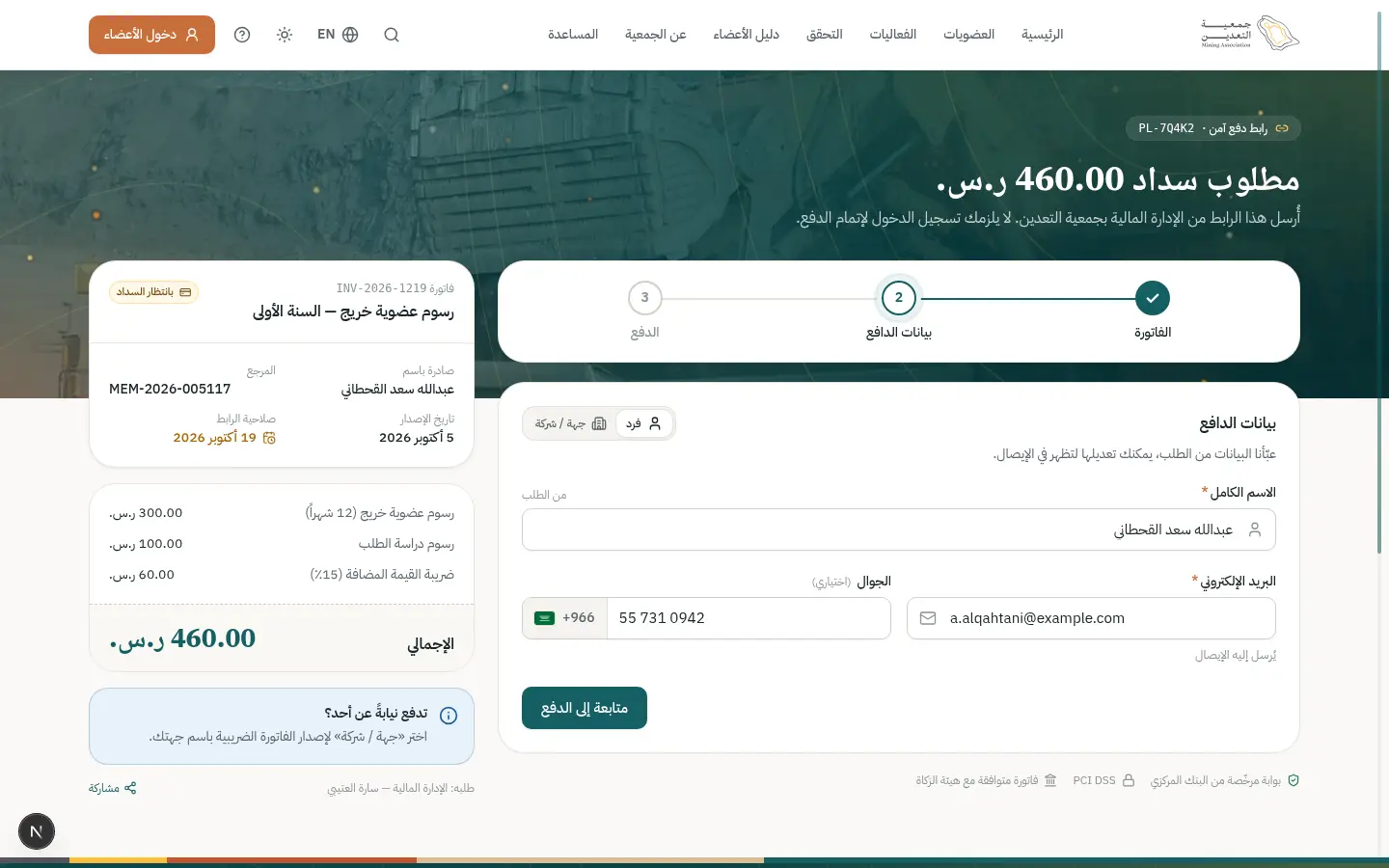
- 4Open this step
Confirmation and receipt
/pay/PL-7Q4K2
Screen: Pay by link
- What the user does
- Receives payment confirmation and a receipt.
- What the system shows
- A success screen with the transaction number and emailed receipt.
Components used
- SuccessMomentA big success moment
Why here: A confirmation moment.
States: Success (gold dust) · calm under reduced motion
- AlertInline page alert
Why here: Receipt-sent alert.
States: Info · success · warning · error
UI states covered
- SuccessInstant confirmation and a tax receipt.
Features:
PAY-07PAY-05 - 5Open this step
Automatic matching
/admin/finance
Screen: Finance
- What the user does
- Finds the payment matched to its link.
- What the system shows
- A transaction in the table marked paid and tied to the link.
Components used
- DataTableTable with views, filters and record sheet
Why here: The transaction carries the link reference.
States: Loading · empty · multi-select · board
- StatusBadgeStatus with colour, icon and text
Why here: Paid / matched.
States: Every dictionary status
Features:
PAY-06PAY-09
19 · #campaign
A renewal reminder campaign
Pick the audience, prepare the message, send and measure the result.
- Who
- Dana, the association's communications officer.
- Goal
- Remind members whose membership ends within 30 days.
- Entry point
- “Campaigns & notifications” in the staff nav.
- Success metric
- A higher early-renewal rate after the campaign.
Effort vs reassurance
Pain points removed
- Generic messages that do not fit the segment
- Sending without a preview
- No impact measurement
- 1Open this step
Preparing the template
/admin/settings/templates
Screen: Templates & messages
- What the user does
- Edits the “renewal reminder” template in Arabic and English.
- What the system shows
- A template editor with variables like {name} and a live preview.
Components used
- Field / InputLabelled text fields with help
Why here: Text fields with variables.
States: Default · focus · error · disabled · read-only
- Choices (Radio / Chip / Segmented)Pick from a few options
Why here: Switch channel: email / SMS / push.
States: Selected · unselected · disabled · focus
- ErrorSummary + AutosaveIndicatorError summary and autosave
Why here: A warning when a variable is missing.
States: Saving · saved · offline · linked errors
UI states covered
- ErrorUnknown variable in the text.
Features:
ADM-02ADM-08NTF-04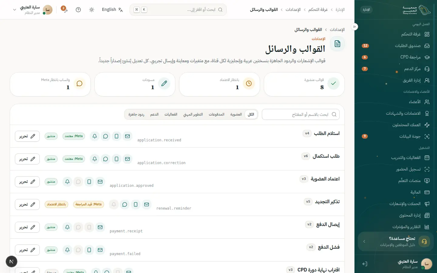
- 2Open this step
Choosing the audience
/admin/notifications
Screen: Campaigns & notifications
- What the user does
- Defines a segment: members expiring within 30 days.
- What the system shows
- Segment filters and the expected recipient count.
Components used
- Select / Combobox / DatePickerReference values and Gregorian/Hijri dates
Why here: Category and date filters.
States: Empty · searching · results · no results
- StatCardA number with trend
Why here: Recipient count instantly.
States: Up · down · flat · loading
UI states covered
- EmptyNobody in the segment: adjust filters.
Features:
NTF-07NTF-08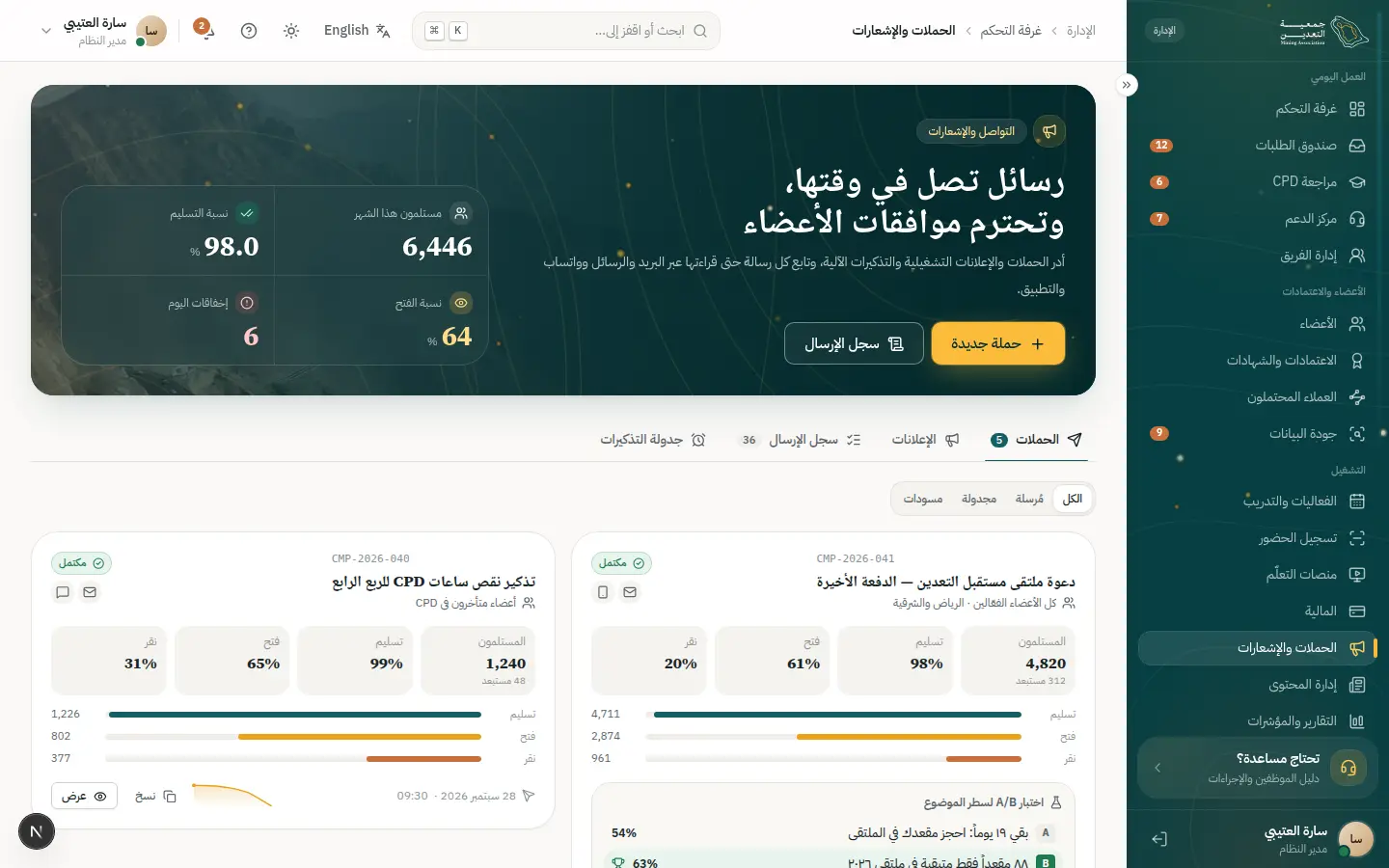
- 3Open this step
Preview and scheduling
/admin/notifications
Screen: Campaigns & notifications
- What the user does
- Previews the message and picks the send time.
- What the system shows
- A test copy to herself and a choice of now or a scheduled time.
Components used
- Sheet / ConfirmDialogSecondary task without leaving the page
Why here: Confirmation before a bulk send.
States: Closed · open · confirm for irreversible
- Select / Combobox / DatePickerReference values and Gregorian/Hijri dates
Why here: Date and time pickers.
States: Empty · searching · results · no results
- AlertInline page alert
Why here: Quiet-hours reminder.
States: Info · success · warning · error
UI states covered
- SuccessCampaign scheduled.
Features:
NTF-09 - 4Open this step
Tracking delivery
/admin/notifications
Screen: Campaigns & notifications
- What the user does
- Watches delivery, opens and failures.
- What the system shows
- Sent / delivered / opened KPIs and a failures list.
Components used
- StatCardA number with trend
Why here: Delivery and open rates.
States: Up · down · flat · loading
- StatusBadgeStatus with colour, icon and text
Why here: Each message's status.
States: Every dictionary status
UI states covered
- LoadingNumbers refresh progressively.
Features:
NTF-10 - 5Open this step
Measuring impact
/admin/reports/builder
Screen: Report builder
- What the user does
- Builds a report comparing renewals before and after.
- What the system shows
- A report builder with columns, filters and a chart.
Components used
- DataTableTable with views, filters and record sheet
Why here: Pick columns and sort.
States: Loading · empty · multi-select · board
- ChartsCharts and trend indicators
Why here: The comparison chart.
States: Data · loading · empty
- notify (Toast)Quick confirmation with undo
Why here: Report-saved confirmation.
States: Success · error · with undo
UI states covered
- EmptyNo data for the period.
Features:
RPT-10RPT-11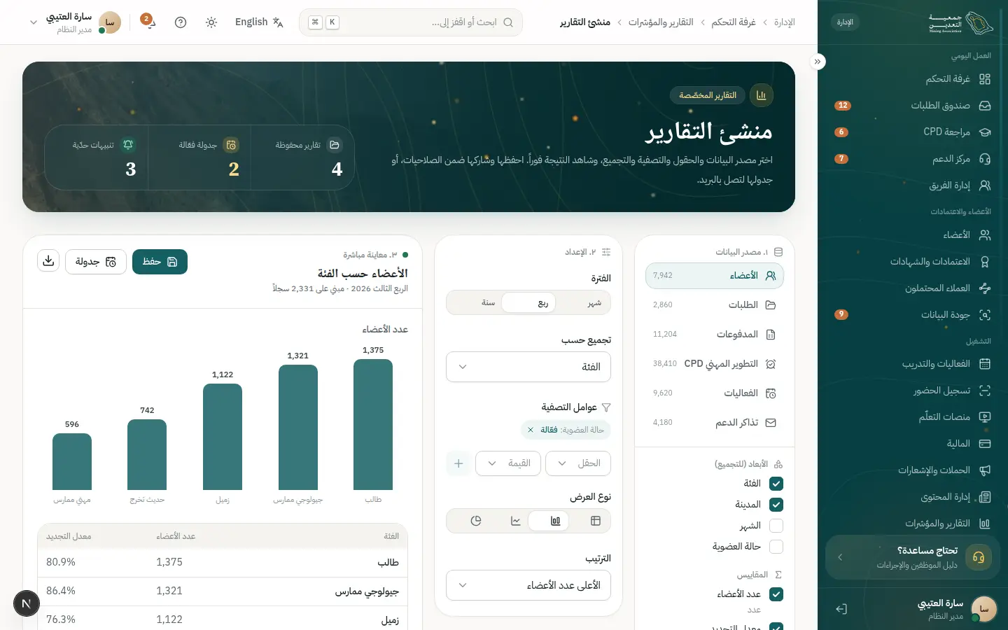
20 · #data-request
Requesting my data or deletion
The member asks for his data and staff fulfil it within a documented deadline.
- Who
- Omar, a member who wants a copy of his data then deletion, and Mona, the compliance officer.
- Goal
- Exercise his rights clearly with a recorded outcome.
- Entry point
- “Settings & security” or the privacy policy.
- Success metric
- The request fulfilled within the legal deadline.
Effort vs reassurance
Pain points removed
- Not knowing his rights
- No proof the request arrived
- Deletion touching required financial records
- 1Open this step
Knowing the rights
/privacy
Screen: Privacy policy
- What the user does
- Reads the privacy policy and his rights.
- What the system shows
- Collapsible sections and a “Submit a request” button.
Components used
Features:
SEC-08SEC-09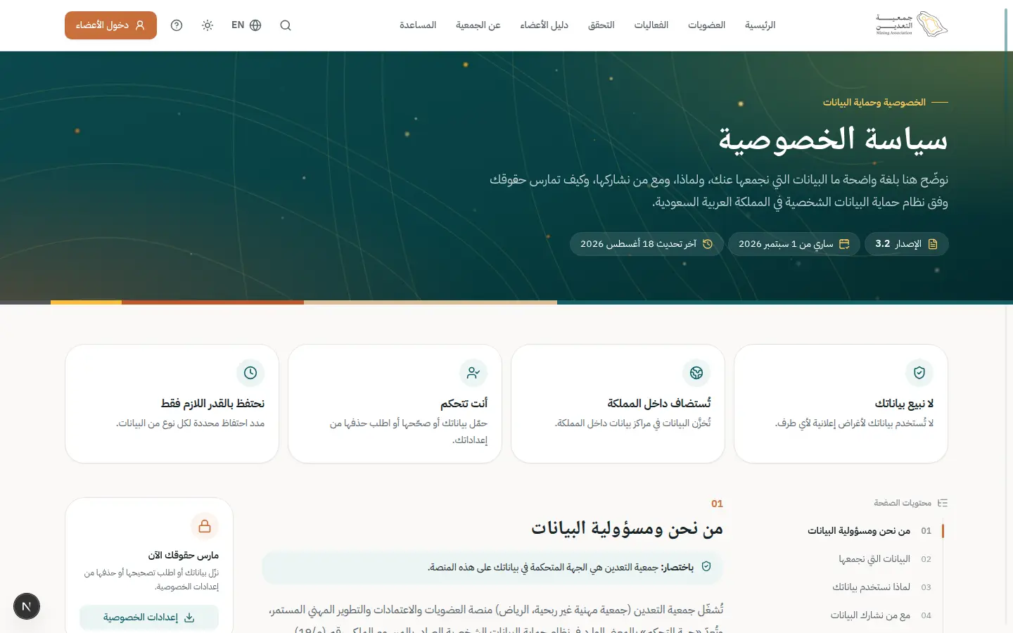
- 2Open this step
Submitting the request
/portal/settings
Screen: Settings & security
- What the user does
- Chooses “Copy of my data” or “Delete my account”.
- What the system shows
- Two options with their impact and a confirmation before deletion.
Components used
- Choices (Radio / Chip / Segmented)Pick from a few options
Why here: Request type.
States: Selected · unselected · disabled · focus
- Sheet / ConfirmDialogSecondary task without leaving the page
Why here: Confirmation for an irreversible action.
States: Closed · open · confirm for irreversible
- AlertInline page alert
Why here: A note on what is retained by law.
States: Info · success · warning · error
UI states covered
- SuccessRequest number and expected completion date.
Features:
IAM-09SEC-09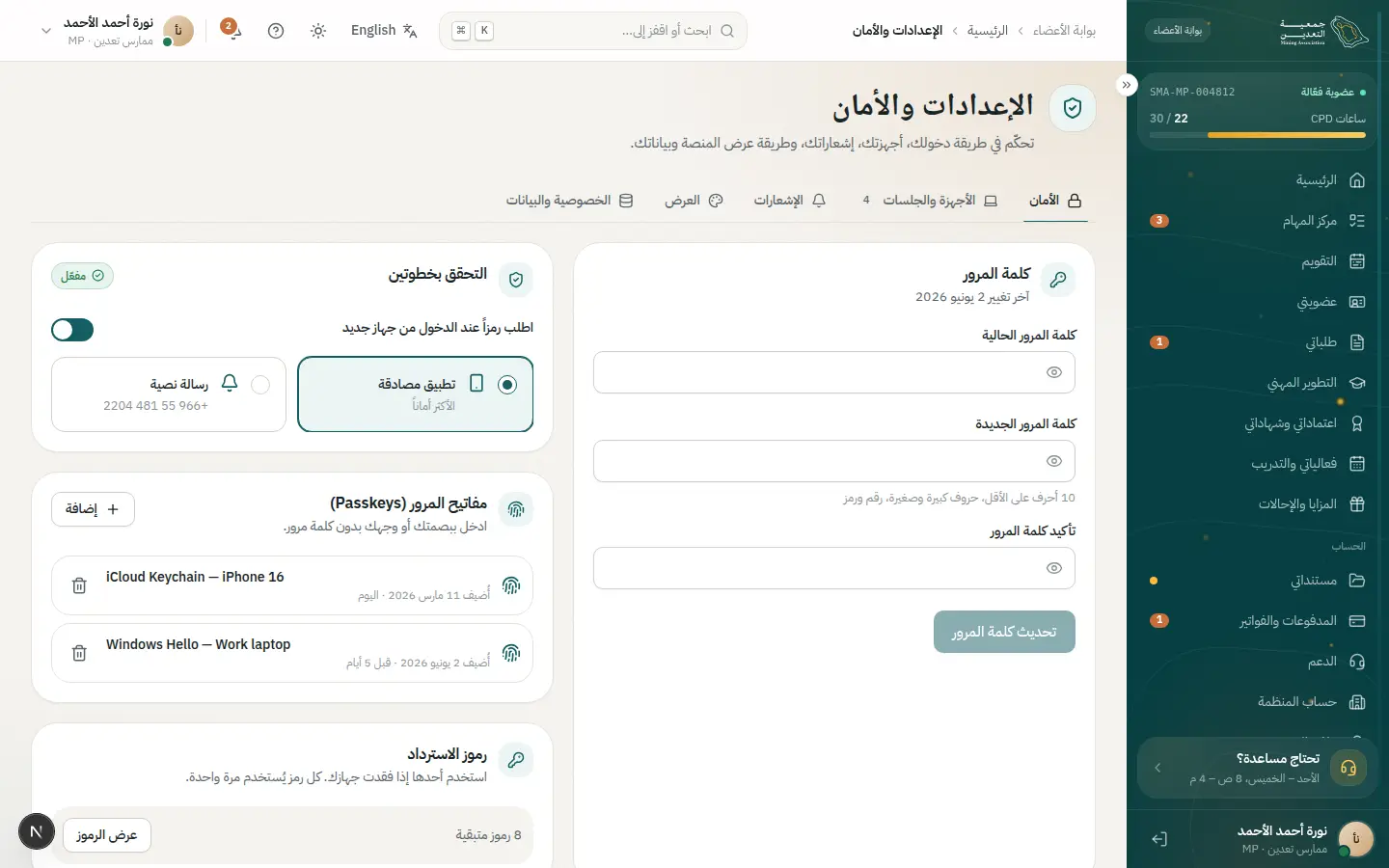
- 3Open this step
Receiving the request
/admin/privacy
Screen: Privacy & compliance
- What the user does
- Mona sees the request in the privacy inbox.
- What the system shows
- A requests table with deadline, status and type.
Components used
- DataTableTable with views, filters and record sheet
Why here: A saved view for near-deadline requests.
States: Loading · empty · multi-select · board
- StatusBadgeStatus with colour, icon and text
Why here: New / in progress / done.
States: Every dictionary status
UI states covered
- EmptyNo open requests.
Features:
SEC-09SEC-10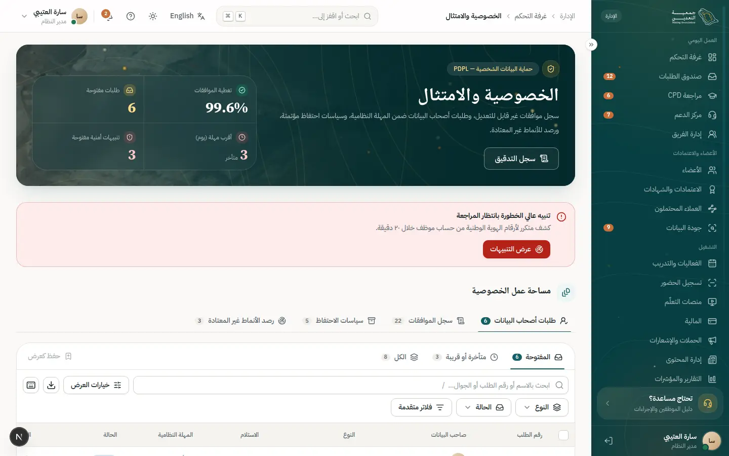
- 4Open this step
Fulfilment
/admin/privacy
Screen: Privacy & compliance
- What the user does
- Compiles the data or deletes, excluding required financial records.
- What the system shows
- A checklist of covered systems and a “Complete” button.
Components used
- ReadinessChecklistBlockers, each with a direct action
Why here: The checklist of included systems.
States: Blocked · ready · all done enables CTA
- Sheet / ConfirmDialogSecondary task without leaving the page
Why here: A double confirmation for deletion.
States: Closed · open · confirm for irreversible
- notify (Toast)Quick confirmation with undo
Why here: Completion confirmation.
States: Success · error · with undo
UI states covered
- ErrorA system did not respond: retry.
Features:
SEC-10SEC-12 - 5Open this step
The audit trail
/admin/settings/audit
Screen: Audit log
- What the user does
- Checks the operation was logged.
- What the system shows
- A log of who did what and when without exposing the data itself.
Components used
Features:
SEC-05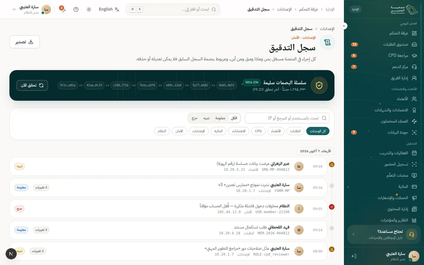
- 6Open this step
Completion notice
/portal/notifications
Screen: Notifications
- What the user does
- Omar receives a notice of the outcome.
- What the system shows
- A time-limited secure download link or a deletion confirmation.
Components used
UI states covered
- SuccessRequest completed.
Features:
NTF-06SEC-09
21 · #onboarding-staff
Onboarding a new employee
From creating the user to a secure first sign-in and assigned work.
- Who
- The system administrator adds Yaser, a new application reviewer.
- Goal
- Yaser starts with only the right permissions and a protected account.
- Entry point
- “Users & teams” in settings.
- Success metric
- An employee productive within an hour with no excess access.
Effort vs reassurance
Pain points removed
- Over-broad default access
- Shared passwords
- Unknown team workload
- 1Open this step
Creating the user
/admin/settings/users
Screen: Users & teams
- What the user does
- Adds the name and email and sends the invite.
- What the system shows
- A new-user sheet and a users list with an “invited” status.
Components used
- Sheet / ConfirmDialogSecondary task without leaving the page
Why here: A sheet keeps the list in view.
States: Closed · open · confirm for irreversible
- Field / InputLabelled text fields with help
Why here: A validated work email.
States: Default · focus · error · disabled · read-only
- StatusBadgeStatus with colour, icon and text
Why here: Invited / active / disabled.
States: Every dictionary status
UI states covered
- ErrorEmail already in use.
Features:
ADM-06ADM-07IAM-14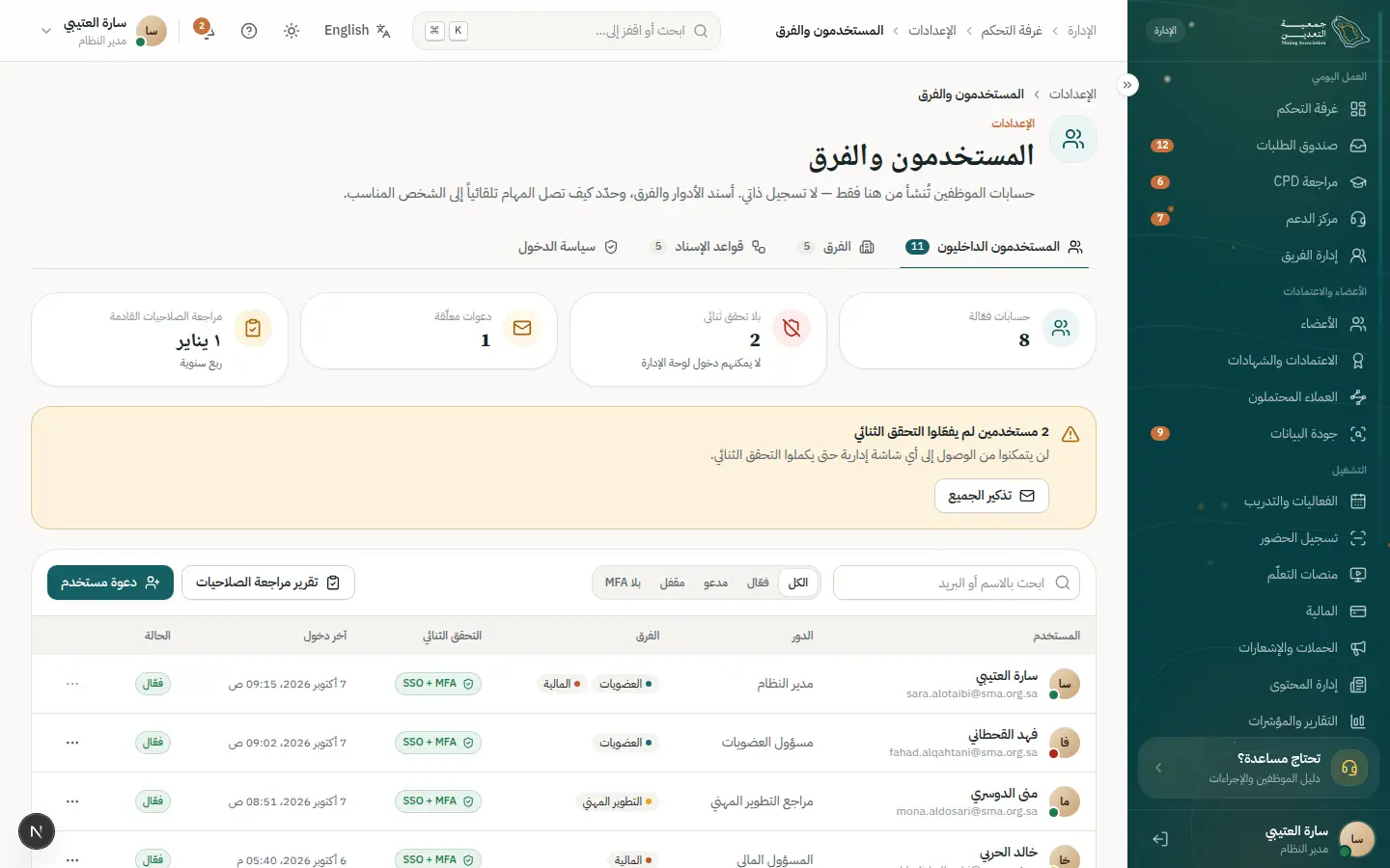
- 2Open this step
Role and permissions
/admin/settings/roles
Screen: Roles & permissions
- What the user does
- Assigns the “application reviewer” role and checks permissions.
- What the system shows
- A permission matrix showing what he can and cannot do.
Components used
- DataTableTable with views, filters and record sheet
Why here: Role-by-permission matrix.
States: Loading · empty · multi-select · board
- Choices (Radio / Chip / Segmented)Pick from a few options
Why here: Clear on/off toggles.
States: Selected · unselected · disabled · focus
- AlertInline page alert
Why here: A warning on a sensitive permission.
States: Info · success · warning · error
Features:
ADM-05ADM-06 - 3Open this step
First sign-in and two-step verification
/mfa
Screen: Two-step verification
- What the user does
- Yaser activates the account and sets up two-step verification.
- What the system shows
- A QR for the authenticator app and a 6-digit code field.
Components used
- OtpInputSegmented verification code
Why here: Code entry with a shake on error.
States: Entry · error (shake) · resend countdown · success
- AlertInline page alert
Why here: Save recovery codes now.
States: Info · success · warning · error
- SuccessMomentA big success moment
Why here: Successful activation.
States: Success (gold dust) · calm under reduced motion
UI states covered
- ErrorWrong or expired code.
Features:
IAM-08IAM-11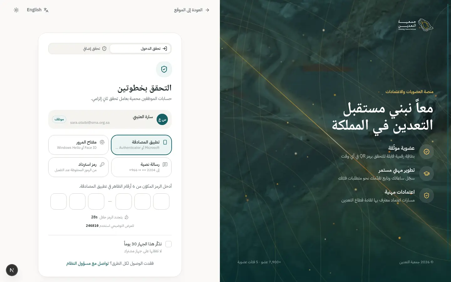
- 4Open this step
Adding him to the team
/admin/team
Screen: Team
- What the user does
- Is assigned to the review team with a workload cap.
- What the system shows
- Team member cards with each person's workload.
Components used
UI states covered
- EmptyA team with no members.
Features:
STF-11REV-13 - 5Open this step
Checking the audit log
/admin/settings/audit
Screen: Audit log
- What the user does
- Confirms user creation and role assignment are logged.
- What the system shows
- “User created” and “role changed” events with the actor.
Components used
Features:
SEC-05
22 · #mobile-day
A day on the mobile app
Card, event and hours from the phone, even without internet.
- Who
- Khalid on the day of the Future Mining Forum, and Salwa at reception.
- Goal
- Get into the hall fast with a card that works without a network.
- Entry point
- The app icon on the home screen.
- Success metric
- Entry in under 3 seconds and hours credited automatically.
Effort vs reassurance
Pain points removed
- Weak hall network
- Printing tickets
- Forgetting to log hours
- 1Open this step
Opening the app
/app
Screen: Mobile app
- What the user does
- Opens the app with biometrics.
- What the system shows
- A home with the card and the nearest event.
Components used
- MembershipCardDigital card with QR
Why here: The card is the first thing he sees.
States: Active · expiring · expired · offline QR
- EventCardAn event or course
Why here: The nearest event he registered for.
States: Open · full · waitlist · registered
UI states covered
- LoadingA fast skeleton on launch.
Features:
MOB-01MOB-02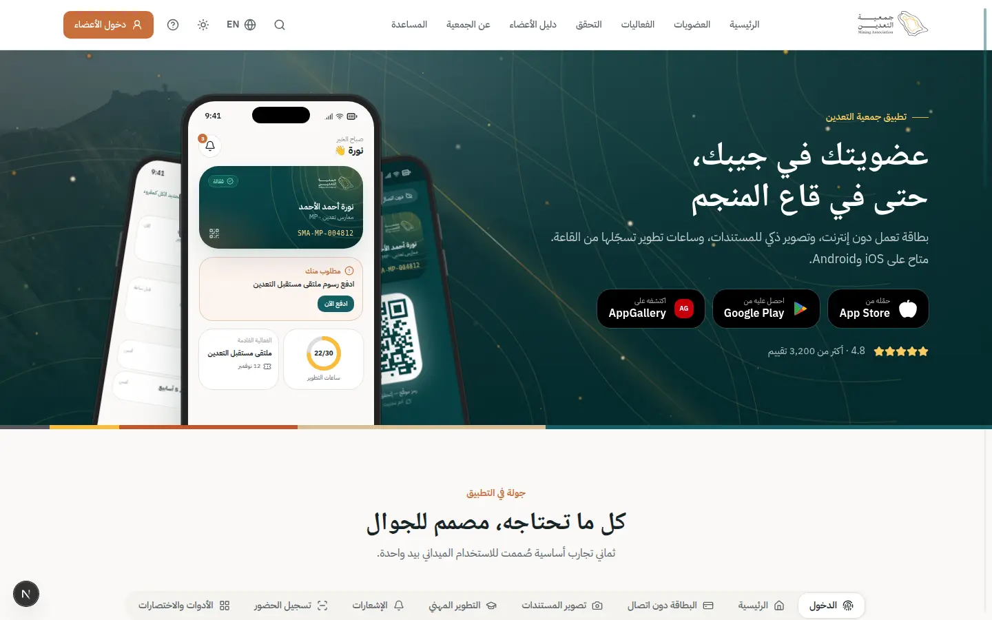
- 2Open this step
The offline card
/app
Screen: Mobile app
- What the user does
- Shows his card at the entrance with a weak network.
- What the system shows
- A card with a rotating signed QR and an “offline” badge.
Components used
- MembershipCardDigital card with QR
Why here: A QR that works offline.
States: Active · expiring · expired · offline QR
- StatusBadgeStatus with colour, icon and text
Why here: An offline badge in text.
States: Every dictionary status
UI states covered
- OfflineLast sync shown and the QR rotates locally.
Features:
MOB-04MOB-05 - 3Open this step
Scanning attendance
/admin/checkin
Screen: Event check-in
- What the user does
- Salwa scans the attendee's QR with the camera.
- What the system shows
- A scan screen with a colour result: welcome / duplicate / unregistered.
Components used
- StatCardA number with trend
Why here: A live attendance counter.
States: Up · down · flat · loading
- StatusBadgeStatus with colour, icon and text
Why here: Present / duplicate / unregistered.
States: Every dictionary status
- notify (Toast)Quick confirmation with undo
Why here: A quick confirmation per scan.
States: Success · error · with undo
UI states covered
- OfflineScans are queued and synced once back online.
Features:
TRN-07MOB-09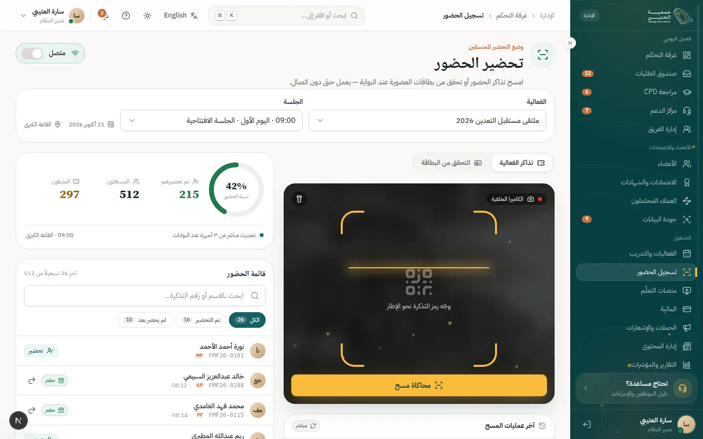
- 4Open this step
Attendance notice
/app
Screen: Mobile app
- What the user does
- Receives a push that his attendance was recorded.
- What the system shows
- A phone push and a short event evaluation.
Components used
- notify (Toast)Quick confirmation with undo
Why here: An instant notice.
States: Success · error · with undo
- Choices (Radio / Chip / Segmented)Pick from a few options
Why here: A tap-based rating.
States: Selected · unselected · disabled · focus
UI states covered
- SuccessAttendance recorded.
Features:
MOB-07TRN-11 - 5Open this step
Hours credited
/portal/cpd
Screen: CPD
- What the user does
- Opens CPD to find the event hours.
- What the system shows
- “Approved” hours and progress rising toward the target.
Components used
- CpdProgressApproved vs required hours
Why here: Progress animates.
States: On track · pending · gap · complete
- SuccessMomentA big success moment
Why here: Hours-credited confirmation.
States: Success (gold dust) · calm under reduced motion
UI states covered
- SuccessAutomatic credit, no request.
Features:
CPD-05CPD-06TRN-12
Components index
Every component and the journeys and steps where it appears, most used first.
- StatusBadge30 uses
Status with colour, icon and text
- Joining the association · 8
- Completing a correction request · 1
- Completing a correction request · 4
- Renewing membership · 2
- Continuing professional development · 3
- Earning a professional credential · 1
- Earning a professional credential · 4
- Attending an event · 4
- Attending an event · 5
- Payment failure and recovery · 4
- Getting support · 3
- Reviewing a membership application · 2
- Reviewing a membership application · 7
- Reviewing CPD activities · 1
- Reviewing CPD activities · 3
- Closing the finance day · 1
- Closing the finance day · 3
- Event check-in (kiosk mode) · 3
- Configuring the platform · 3
- Verifying a card or certificate · 2
- Organization account and seats · 3
- Organization account and seats · 4
- Using benefits and referring a colleague · 4
- Paying through a link · 2
- Paying through a link · 5
- A renewal reminder campaign · 4
- Requesting my data or deletion · 3
- Onboarding a new employee · 1
- A day on the mobile app · 2
- A day on the mobile app · 3
- DataTable19 uses
Table with views, filters and record sheet
- Continuing professional development · 3
- Payment failure and recovery · 4
- Reviewing a membership application · 2
- Reviewing a membership application · 3
- Reviewing a membership application · 4
- Reviewing CPD activities · 1
- Closing the finance day · 1
- Event check-in (kiosk mode) · 1
- Configuring the platform · 4
- Organization account and seats · 1
- Organization account and seats · 4
- Paying through a link · 2
- Paying through a link · 5
- A renewal reminder campaign · 5
- Requesting my data or deletion · 3
- Requesting my data or deletion · 5
- Onboarding a new employee · 2
- Onboarding a new employee · 4
- Onboarding a new employee · 5
- notify (Toast)17 uses
Quick confirmation with undo
- Joining the association · 7
- Completing a correction request · 4
- Continuing professional development · 4
- Attending an event · 3
- Attending an event · 7
- Payment failure and recovery · 3
- Getting support · 5
- Reviewing a membership application · 7
- Reviewing CPD activities · 3
- Event check-in (kiosk mode) · 3
- Organization account and seats · 2
- Using benefits and referring a colleague · 1
- Paying through a link · 1
- A renewal reminder campaign · 5
- Requesting my data or deletion · 4
- A day on the mobile app · 3
- A day on the mobile app · 4
- Button16 uses
Primary and secondary actions
- Joining the association · 1
- Joining the association · 3
- Completing a correction request · 1
- Renewing membership · 1
- Renewing membership · 5
- Attending an event · 2
- Payment failure and recovery · 1
- Payment failure and recovery · 3
- Event check-in (kiosk mode) · 2
- Verifying a card or certificate · 1
- Upgrading membership category · 4
- Organization account and seats · 5
- Using benefits and referring a colleague · 1
- Paying through a link · 3
- Requesting my data or deletion · 1
- Requesting my data or deletion · 6
- Field / Input15 uses
Labelled text fields with help
- Joining the association · 4
- Continuing professional development · 2
- Attending an event · 6
- Getting support · 1
- Reviewing a membership application · 6
- Configuring the platform · 1
- Configuring the platform · 2
- Verifying a card or certificate · 1
- Organization account and seats · 2
- Using benefits and referring a colleague · 2
- Using benefits and referring a colleague · 3
- Paying through a link · 1
- Paying through a link · 3
- A renewal reminder campaign · 1
- Onboarding a new employee · 1
- Alert15 uses
Inline page alert
- Joining the association · 5
- Renewing membership · 1
- Attending an event · 2
- Payment failure and recovery · 2
- Closing the finance day · 2
- Configuring the platform · 3
- Verifying a card or certificate · 3
- Upgrading membership category · 1
- Using benefits and referring a colleague · 3
- Paying through a link · 4
- A renewal reminder campaign · 3
- Requesting my data or deletion · 2
- Requesting my data or deletion · 6
- Onboarding a new employee · 2
- Onboarding a new employee · 3
- Sheet / ConfirmDialog15 uses
Secondary task without leaving the page
- Continuing professional development · 2
- Attending an event · 3
- Getting support · 2
- Reviewing a membership application · 4
- Reviewing a membership application · 6
- Reviewing a membership application · 7
- Reviewing CPD activities · 2
- Closing the finance day · 3
- Configuring the platform · 2
- Organization account and seats · 2
- Organization account and seats · 3
- A renewal reminder campaign · 3
- Requesting my data or deletion · 2
- Requesting my data or deletion · 4
- Onboarding a new employee · 1
Pick from a few options
- Joining the association · 2
- Renewing membership · 4
- Attending an event · 1
- Attending an event · 6
- Payment failure and recovery · 3
- Getting support · 5
- Configuring the platform · 1
- Configuring the platform · 4
- Upgrading membership category · 2
- A renewal reminder campaign · 1
- Requesting my data or deletion · 2
- Onboarding a new employee · 2
- A day on the mobile app · 4
- StatCard11 uses
A number with trend
- Attending an event · 5
- Reviewing a membership application · 1
- Reviewing a membership application · 3
- Closing the finance day · 1
- Event check-in (kiosk mode) · 2
- Organization account and seats · 1
- Using benefits and referring a colleague · 2
- A renewal reminder campaign · 2
- A renewal reminder campaign · 4
- Onboarding a new employee · 4
- A day on the mobile app · 3
- SuccessMoment10 uses
A big success moment
- Joining the association · 7
- Renewing membership · 6
- Earning a professional credential · 5
- Closing the finance day · 4
- Upgrading membership category · 5
- Organization account and seats · 5
- Using benefits and referring a colleague · 4
- Paying through a link · 4
- Onboarding a new employee · 3
- A day on the mobile app · 5
- Timeline10 uses
Request events with dates
- Completing a correction request · 3
- Completing a correction request · 4
- Continuing professional development · 4
- Earning a professional credential · 4
- Getting support · 3
- Getting support · 4
- Reviewing a membership application · 5
- Using benefits and referring a colleague · 4
- Requesting my data or deletion · 5
- Onboarding a new employee · 5
- MoneySummary / AuditSummary10 uses
Amount, VAT and total
Reference values and Gregorian/Hijri dates
- MembershipCard7 uses
Digital card with QR
- CategoryCard6 uses
Membership category card
- FileUpload6 uses
Upload or attach a verified document
- DocumentCard6 uses
A document and its status
- CpdProgress6 uses
Approved vs required hours
Error summary and autosave
- OtpInput4 uses
Segmented verification code
- NextStepPanel4 uses
Who owns it? What do I do? When?
- ReadinessChecklist4 uses
Blockers, each with a direct action
- EventCard4 uses
An event or course
- Accordion3 uses
Collapsible Q&A
Loading, empty and error
Where the user is in the flow
- Charts3 uses
Charts and trend indicators
- VerificationSeal3 uses
Public verification result
- Staff nav2 uses
Permission-filtered navigation
- Public header1 uses
Visitor navigation
- TaskCard1 uses
A task that opens its screen
- Portal shell1 uses
Side/top bars and ⌘K search
- CertificatePreview1 uses
The digital certificate
Wayfinding and paging
Welcome and today's numbers